Design
How the Apple Watch is influencing Apple’s future
Apple is giving iPhones and cars elements of watchOS' glanceable UI. This kind of bite-sized ambient computing could be crucial for a mixed reality headset.

Of the visual redesigns Apple introduced at WWDC 2022, the changes to the lock screen coming with iOS 16 and the hardware integration of CarPlay coming sometime in the next three years, are by far the most eye-catching.
Apple is embracing a more holistic sense of customization, letting your devices (and someday, cars) look more how you want them to look, in a way that shares a surprising (but maybe not unsurprising) lineage with the Apple Watch, the company’s “most personal device ever.”
Watch me
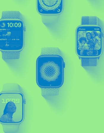
If you’ve used an Apple Watch before, everything about Apple’s customization options in iOS 16 should seem familiar. The lock screen can use different fonts, colors, and interactive wallpapers in much the same way the watch faces of the Apple Watch can. It’s an added bit of personality, but with guard rails, as is Apple’s way.
The similarities go beyond functionality to the user interface too, though. Those round borders that appear around elements that can be modified? That’s from the Apple Watch. A scrollable list of pre-made options that you can hop in and customize yourself? Straight off the Apple Watch as well.
Complications and Widgets
The same thing applies to the “widgets” Apple is adding as part of the redesigned lock screen. They look quite a bit like watchOS complications, and at least as far as Apple showed in its keynote, they’ll offer the same kind of glanceable, low-interaction information.
As reported before, besides making the lock screen more useful at a glance (and weirdly removing some of the need for an Apple Watch) these widgets set the stage for an always-on display on the iPhone 14. Coincidently, that’s a feature Apple already offers on the Apple Watch starting with the Series 5.
Now I don’t want to overstate this, it makes sense Apple would apply its design language in similar ways across different devices. I’m just surprised how directly this seems to be evoking elements from watchOS. And I welcome it.
CarPlay
Many of the details are less clear (and exactly when it’ll arrive seems increasingly far away) but the next generation of CarPlay clearly pulls from the modular, modifiable spirit of watchOS. Gauges on an instrument cluster are a very different beast than complications on a smartwatch, but Apple wants you to have control over them all the same.
Maybe even change the color and shape of them too, depending on just how much say car makers ultimately have.
Nuggets
The surface-level impact of the Apple Watch might be Apple finally dipping its toes in the world of personalized interfaces but in the long term, the way the wearable makes developers think small — with nuggets of information rather than a three-course meal — could be even more important.
Apple’s not ready to show its mixed reality headset cards just yet (though you can certainly see hints in its WWDC 2022 announcements according to our own Ray Wong). But it seems to me that if the company is interested in interfaces you wear, and software interactions that obstruct your field of view or at least hang out around it, the smaller glanceable UI of watchOS could be a good source of inspiration. The Apple Watch’s influence just might be bigger than its wrist-sized screen appears.