Reviews
Moto 360 (2019) review: as ordinary as smartwatches get
It works, but boy is the non-Apple Watch smartwatch landscape bleak.

Before the Apple Watch became the best smartwatch to get, Motorola wowed everyone with the Moto 360, the first smartwatch with a round display. Nobody had done a round smartwatch before, which was actually really groundbreaking stuff... in 2014.
In 2019, though, round smartwatches are the norm. Fossil, Michael Kors, Samsung — everyone except Apple sells round smartwatches that look more watch than mini smartphone-on-your-wrist. This ubiquity makes the new Moto 360 a very forgettable smartwatch. There’s nothing about it that stands out. I felt cold nothingness wearing it. Actually, that’s not true. I did feel something: I couldn’t wait to unshackle it from my wrist every night.
Goodbye Moto — The Moto 360 carries the Motorola branding, but it’s actually produced by eBuyNow, an obscure vendor that claims to use “proprietary tools to identify precise market gaps, and proceed to build, market, and distribute promising consumer electronics with a strictly results-oriented approach,” which kind of sounds like Relativity Media, the “data-driven” film studio that crashed and burned in 2016. Basically, this company licensed the Moto 360 branding to revive the smartwatch. It arrives on January 10 and costs $349.99.
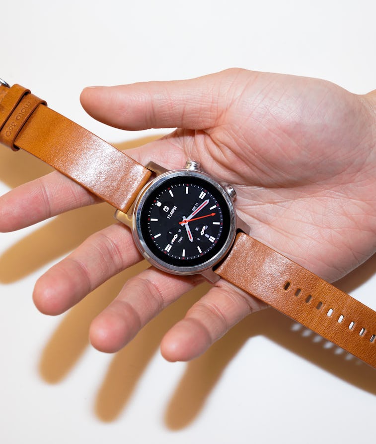
Cold, soulless vibes — What can I say that you can’t get from looking at photos of the smartwatch? The Moto 360 resembles every other Wear OS smartwatch: exceptionally ordinary. I’ll give eBuyNow props for keeping the stainless steel case on all three finishes (rose gold, silver, and black) as minimalist as possible. Compared to other Wear OS smartwatches like Michael Kor’s Lexington 2 or Fossil’s generically named Gen 5 Smartwatch that come with decorative frills, the Moto 360 is clean-looking.
The 1.2-inch (390 x 390 resolution) AMOLED display is sharp and comes with an always-on mode that always shows the time (good!). There are two buttons: one paired with a rotatable crown for scrolling through screens and menus and another that functions as a back button. The smartwatch is water resistant and eBuyNow’s website says it’s been tested for 10,000 swim strokes. I showered with it and it didn’t explode or stop working.
The Moto 360’s straps are standard 20mm watch bands, which means there are plenty of cheap third-party options you can pick up. The smartwatch comes with a leather and silicone band. The leather strap is still as flawed as the original Moto 360’s; I have no idea why the first loop is so high up on the band that it’s practically impossible to strap it on without fuss.
All of these things are essential like working wheels and functional headlights on a car. There’s no need to give high fives for getting the basics right. But at the same time, I guess I should be impressed that an unknown company was able to successfully make a smartwatch bearing the Motorola branding that doesn’t embarrass its predecessors.
The new Moto 360 is a soulless shadow of its predecessors that highlights how bleak the smartwatch landscape is.
Just another Wear OS smartwatch — It works. The usual smartphone stuff like tapping on notifications, and calling up the Google Assistant, and tracking runs is neither super snappy nor sluggish; the Qualcomm Snapdragon 3100 chip and 1GB of RAM powering the Moto 360 are fine I guess.
My biggest gripe with the new Moto 360 is how immensely dull it is. I ditched my regular watch and Apple Watch for the Moto 360 and couldn’t wait to swap back to them by the end of a week. It’s not even that the Moto 360 has all of the strengths and weaknesses of every other Wear OS smartwatch (like it works best with Android phones and even though it connects to iPhones it doesn’t work with iMessage). But more that there’s really nothing, feature-wise, that screams “oh, this is really freaking awesome.”
There are no health or heart features that are remotely comparable to what the Apple Watch offers. Native features like fall detection, cycle tracking, and an ECG app also don’t exist. There are some third-party apps that fill in the gaps, but they’re not the same. Even extra-long battery life would have given the Moto 360 some more oomph, but alas, it has the same one-day battery life as other Wear OS smartwatches.
Tons of cheaper alternatives — $350 is a nice bundle to drop on such an uninteresting smartwatch. There’s nothing wrong with the new Moto 360 per se, but there’s also nothing remarkable about it, either. A quick search online brings up dozens of similarly-spec’d Wear OS smartwatches with fit and finishes that are just as nice (or better) for less. Indulging in nostalgia works for iconic products with ever-lasting cultural impacts, but not for the Moto 360.
The original Moto 360 laid the groundwork for others to build on. The new version is a soulless shadow of its predecessors that highlights how bleak the smartwatch landscape is. The Apple Watch is so far ahead (and widening the gap with every new version) that I wonder if it’s even possible to make a real competitive smartwatch at this point. The bar is higher than “just good enough,” and all the data-driven marketing in the world won’t make the Moto 360 anything more than that.