WWDC 2020
iOS 14's App Library has already changed my brain
Even Android didn't do this.

I absolutely hoard apps. I don't know when it started, but at some point, I got sick of the process of using an app, deleting it, time passing, then having to re-download the app just to do one thing, and then deleting it again. Rinse. Repeat. So I stopped uninstalling them. If there was a chance I'd use that store or photo editor again, I just left it. Compounding this is the belief that if I deleted premium apps and games I'd already paid full price for, even if I wasn't using them, I wouldn't get my money's worth. Illogical? Yes. Insane? Probably.
But yesterday I got iOS 14, and things changed. I feel like a weight has been lifted off my digital life.
I'll preface the rest of this by saying that phone clutter is not a real problem. Full stop. But there's no denying that for someone as addicted to their phone as I have been my entire life — and it's only gotten much, much worse in self-isolation — I never really enjoyed using it.
iOS and Android's methods for dealing with apps always made some level of utilitarian sense to me, but the more time that passed, the more my digital life would grow increasingly complex, and the more chaos reigned on my home screen. At some point, I had somewhere in the neighborhood of 200 games across two folders in alphabetical order that I was maintaining despite the fact that I mostly use my Nintendo Switch. Deeply unwell. The forthcoming iOS brings the order I needed.
Not a drawer, a library — Apple's latest update to iOS, dropped yesterday at WWDC, changes this entirely with a little feature call App Library. At first blush, App Library seems a lot like the App Drawer that has been a mainstay on Android. I've long been a fan of the App Drawer — which stores all of your apps away and off your home screen where you don't need to constantly be confronted with your software purchasing habits. Google's solution, though, only recently started leveraging Google's AI prowess to suggest a row of apps you might need on the home screen via a beta release. While this helps relieve the issue somewhat, you still find yourself digging through the App Drawer looking for what you want.
App Library is different. App Library is a bunch of algorithmically suggested folders presenting you with what you're most likely to need access to at any given moment. Should you still not find what you need, there's a search function that displays everything you've installed, much like an alphabetized, itemized version of Google's App Drawer, but I haven't needed that yet.
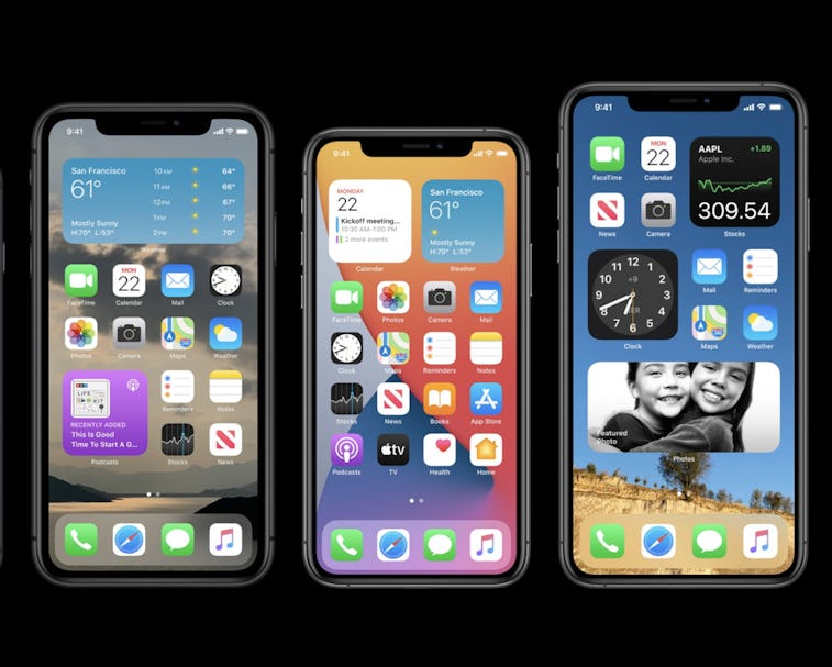
The first thing I did after installing the iOS 14 beta was to delete the home screen icons of every one of my hundreds of apps to winnow the interface down to one single page of services I actually need. From this screen I can also use iOS's universal search to find things in exactly as many taps as I was doing before — without the clutter or the need to hand organize and alphabetize my collection.
Folders be gone — Before, I was organizing apps into little folders based on categories and then alphabetizing those apps so they were easy to find. With iOS 14 I just... don't. And I get the same results.
Now that my apps are out of sight, they are entirely out of mind. I don't find myself compulsively opening Depop and eBay when I'm bored. I don't find myself trying to keep up with every social media feed. Yet I can still use everything I need whenever I actually need it, and the system usually anticipates what that is.
It's a small thing, cleaning up your phone interface. It will not stop the coronavirus. It will not abolish the police. It will not make Bernie Sanders president. But it has given me the control I wanted over my phone and the freedom to stop managing my digital life at the same time. I'm having my tiny cake and eating it too. It's nice.