Tech
Microsoft's adding vertical tabs to Edge and promising faster load times
The Chromium-based browser is looking more and more like a legitimate Chrome challenger with each update.

Microsoft's bringing some new features to its Edge browser and its Bing search engine, and you've got to give it points for trying. After Internet Explorer became the butt of browser-related jokes, the Chromium-based Edge has proven a worthy rival to market dominator, Chrome, and not just because it has a better built-in game. Edge uses fewer resources than Chrome, while still supporting the same extensions, making it easy for Chrome users to switch. Bing meanwhile, well, it's not enjoyed the same reception. Today Edge gets vertical tabs and faster load times, while Bing gets a new way to handle recipes and other multifaceted content.
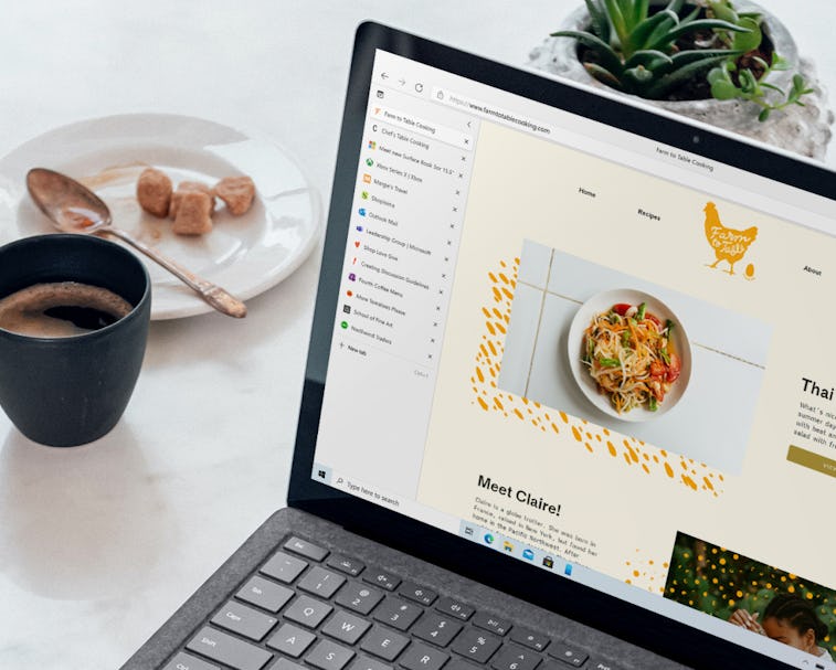
Stack 'em up — As any self-respecting tab hoarder knows, there comes a time, around 20 tabs in, where the only way to distinguish tabs is by their favicons, because their headers have been squished down to the point of being a letter or two, if not totally invisible. To combat this — and make it easier to navigate the tabs you've had languishing in your browser since there was a dogless President in The White House — Edge now lets you arrange tabs vertically with the click of a button.
Load 'em fast — Microsoft's also added something called "startup boost" which will roll out later this month and which it claims improves the time it takes to open Edge and reload tabs from a previous session after rebooting or relaunching the browser. Microsoft's claiming an improvement of between 29 percent and 41 percent.
Performance updates are a big deal for Microsoft, and last month it added the option for tabs to put themselves to sleep automatically after a certain period to cut down on CPU and memory usage, while also extending battery life.
Context is king on Bing — Bing might be struggling to find an audience, but Microsoft's not giving up on it. Today it's adding " interactive Bing search results" that show more context on search results without having to open links. In the announcement, Microsoft uses recipes as an example.
"For instance, with more people cooking from home, we’ve heard many mention that they are overwhelmed by the sheer amount of recipe options online, and frustrated by recipes hidden below long introductions and ads. To help with that, we’ve released an updated recipes experience that extracts and aggregates the most relevant recipe content and presents it in a single view on the search results page," the company's Liat Ben-Zur, CVP of Modern Life and Devices says.
Microsoft's also added an infographic-like sidebar layout for certain search results to make it easier to parse pertinent information without having to navigate to individual links. The company uses the example of searching for information on animals, tourist destinations, or what it calls "list-centric search queries" like “best rivers to visit” or “most interesting volcanoes.”
Ben-Zur explains, "Instead of getting just a text result, or information on a single answer, you get an explorable overview of relevant image-led content."
Will these updates get us using Bing instead of Google or the more privacy-focused DuckDuckGo? Probably not, but maybe, one day, Bing will pull an Edge and suddenly become compelling enough for us to switch. Stranger things have happened.