Tech
Twitter for iPad is getting a welcome redesign
But no, we still won’t be able to edit tweets.

For the most part, big-name services tend to make standalone apps for iPhones and iPads. Given the differences in screen size between the two, it makes sense. Twitter, however, has been happy to let users use an iPhone-optimized app on both. And it’s meant a crummy experience on the iPad. That’s about to change.
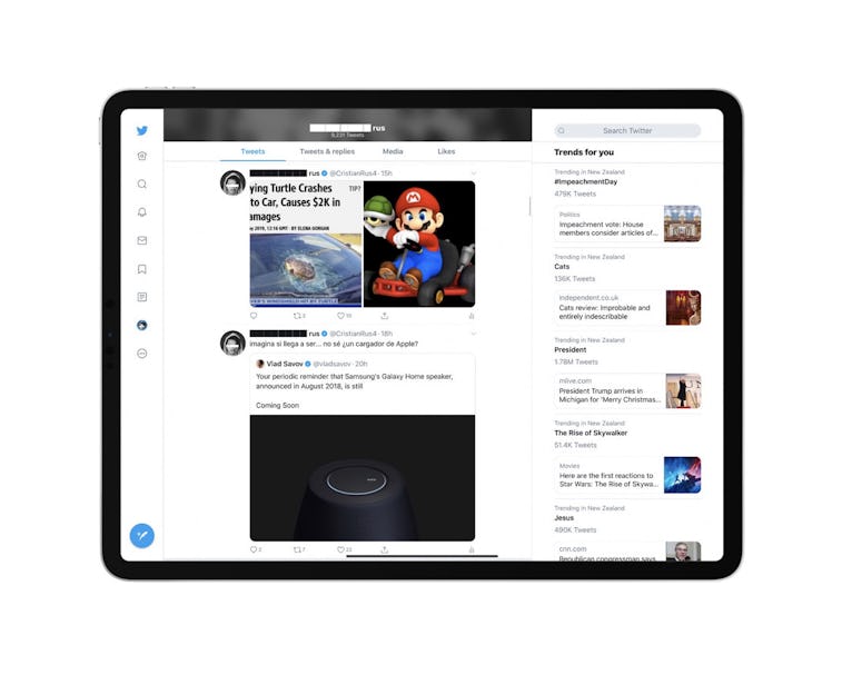
Up to three columns — According to Applesfera, the new iPad app allows for up to three columns of content at once. It’s unclear for now how much you’ll be able to customize those columns and while we don’t expect it’ll be a full Tweetdeck-like experience, we’re excited we’ll be able to see more than one at a time at all.
Other changes — The menu bar is also moving to the side, with the center column showing the timeline and the right showing variable content based on menu navigation, like trending topics. The app works in both portrait and landscape orientations, and really, it looks a lot like the web version of Twitter.
The iPad Twitter app is available in the App Store. If you’re not seeing the update yet you’ll have to wait for it to appear as there’s no way to turn on the new layout manually. We’ve reached out to Twitter for comment about the update.
Update: Twitter has confirmed the changes via a spokesperson, stating "We've made updates to Twitter for iPad to bring it to parity with the other ways people use Twitter currently on iOS, Android and Web. We want everyone to have a more consistent Twitter experience and not need to relearn how to use Twitter any time they switch devices."