iCloud Clusterfuck

Luckily, I don’t have to use this kind of title often. But when I do, there’s a good reason: this year’s beta release cycle for all of Apple’s operating systems has been a mess. The months since WWDC in June have been a terrible experience for both customers and developers alike and the literal center of the chaos was Apple’s iCloud syncing service.

For us, it all started with customers reporting lost Linea sketches in their iCloud Drive. Initial investigations led to a common factor: all of the people affected had installed the iOS 13 beta release.

And when I say lost, I mean really lost. Entire folders were either gone or corrupted. Apple’s mechanism to recover deleted files was of no help. The customers with weird folder duplicates were the “lucky” ones.

We couldn’t find any problems in our code and there was no information from Apple about problems with iCloud, so we did the only thing possible: we blocked people from using Linea on iOS 13. If a customer absolutely needed the app, we got them onto TestFlight after a stern warning about the real possibility of losing data.

A few weeks later, Apple finally indicated that there were some issues with iCloud and the beta release. In the same week, they released a public beta and sent out an email to customers encouraging them to try out iOS 13.

We did our best to understand the situation and provide information to Apple, but it felt like we were tossing bug reports into a black hole. The most discouraging part was when we tried to open an incident with Apple Developer Technical Support (DTS). After writing up a detailed report, we were informed that they don’t support beta releases!

By the time beta 6 rolled around, things were improving, but there were still isolated reports that the service might not be completely back in working order. Confirming the fixes on our end was impossible: the folks who’d encountered the previous data loss had no desire to mess with iCloud again.

Now it appears that the entire stack is getting rolled back and there won’t be new iCloud features in iOS 13 (at least initially.) I honestly think that’s the wisest course of action at this point. My only wish is that Apple would make an official statement.

Now that we’re past the worst of it, it’s time to think about why this whole episode happened and how it can be prevented in the future.

Folks don’t understand beta

Apple’s biggest fuck up was a bad assumption about who is testing a beta release. In WWDC presentations and developer documentation, there’s always warnings about using the release on non-production devices and only with test accounts.

But there are many folks that are just looking to get the new and shiny features. In past iOS beta releases, Apple hasn’t suffered too much from this because the early software was relatively stable. Maybe you got some dropped calls or bad battery life, but it was nothing too serious.

These early adopters installed iOS 13 and expected a similar experience. They also weren’t using an iCloud test account, so any instability in the beta release propagated bad data to their other devices.

Developers have long known to unhook external drives when testing a new OS release. Shit happens, and that’s OK because it’s a beta and we expect a bumpy road. In fact, I currently have an external Photos Library that I can’t use in Mojave because it got upgraded when I booted into Catalina: it’s my dumb mistake and I have no complaints.

Anyone who’s not a developer, and hasn’t been burned by a bad OS, does not know the kind of trouble that lies ahead. It’s irresponsible for Apple to release a public beta with known issues in iCloud. It’s doubly egregious to then promote that release with an email campaign to customers. For a company that prides itself in presenting a unified front, it sure looks like the left hand doesn’t know what the right hand is doing.

Disconnect iCloud by default

The solution to this situation is relatively simple, but with painful consequences. Apple needs to help unwitting customers by automatically disconnecting that external hard drive called iCloud.

If a device is using an Apple ID that’s also being used on a non-beta device, then iCloud shouldn’t be allowed. If you install an iOS beta on your iPad, it doesn’t get to use any cloud services because it puts the data on your iPhone or Mac at risk.

Of course, once this restriction is put into place, Apple will quickly realize that no one is testing iCloud or anything that touches it. If a beta tester can’t have their contacts, synced notes, reminders, and appointments over the course of three months, they’re not going to be testing much. I’d also expect to see lots of guides on “How to Get Back on Normal iOS” around the web.

But there’s a better, and even more unlikely solution…

iCloud can’t be a beta

Because it’s a service, iCloud doesn’t get to go into beta. It needs to be reliable all the time, regardless of whether iOS or any other platform is in beta test.

As it is now, Apple is effectively telling you that your storage device will be unreliable for a few months. It’s like having a hard drive where the manufacturer tells you it won’t work well for ¼ of the year. Would you purchase storage with a caveat that “the drive mechanism may not work properly during the hot summer months”?

You don’t see these kinds of issues with Google Drive or Dropbox because they don’t get a pass while an OS is being tested. Dropbox moved your folders from AWS to their own servers without you noticing even the slightest hiccup. Compare this to the last three months of iCloud in beta.

And yes this is a hard task: akin to swapping out the engines of an airplane in mid-flight. But data services, like hard drives, must work all the time.

We’re well past that point with iCloud and it’s just going to get worse as Apple moves more of our data there. This time next year, will I suddenly not know which episodes I’ve watched on Apple TV? Or will I suddenly lose all my scores and achievements in Apple Arcade? Will I shoot myself in the foot with some cool new feature in iOS 14?

Unfortunately for Apple, breaking iCloud away from the OS isn’t a simple problem to solve. It’s not a technical challenge as much as it is an organizational one: a move from a functional form to a divisional one.

So while we all dream of an OS release roadmap to ease the transition to new features, Apple needs to give some very close to attention to the underlying services that would enable that new way of working.

The lack of substantive communication about iCloud’s problems this summer shows how far the company has to go in that regard. You can’t use a roadmap without letting people know about your successes and failures. There will be wrong turns, and you can’t continue on in silence when people depend on the service’s reliability.

iCloud gives data a bad name

As a developer whose job requires frequent beta installations, this year’s problems with Apple’s service has brought something clearly into focus: as much as I love the functionality that iCloud provides, I cannot put my valuable data at risk.

And you can bet your ass that I have a new backup strategy for anything that’s in iCloud Drive. (Hint: rsync and ~/Library/Mobile Documents.)

As an Apple shareholder, I also worry about how these failures will damage the iCloud brand. Apple’s growth hinges on services and when they get a bad name, the stock price can only go one way. There is only one brand that people think of when you mention “click of death”.

I sincerely hope that Apple can address these issues, because I love the idea of services that focus on simplicity and privacy. I know my last clusterfuck memo got some notice within the company, and I hope this one does as well.

Swift Changes Considered Harmful

I like Swift. We’re using it for new products like Linea, which was written from the ground up with the new syntax. In spite of this, I still consider the language harmful.

The best way to understand the issues is by imagining that you’re an iOS developer who wants to write their first macOS app.

You find this sample code and it has exactly what you need:

PhotoEditor: Crafting Modern Cocoa Apps

The sample demonstrates several Cocoa technologies and features, including:

  • Storyboards
  • Unified window titlebar
  • Full-sized content view with behind-toolbar blurring
  • NSAppearance (“dark mode”)
  • Sandboxing
  • Resume (state restoration)
  • Modernized event tracking
  • Modernized drag & drop
  • UI validation

The best part is that these bits are fresh — it was published in October 2016 for Xcode 8 running on macOS Sierra. Perfect!

Build and Not Run

Everything is great until try to build and run that project. Xcode displays 12 issues that you’ll need to deal with before you can try out the sample.

A bunch of the errors are due to private protection levels on instance variables. Unfortunately, there’s no automatic fix for this issue. But even though you’re no expert in Swift, you find that changing the definitions to public seems to clear things up.

A harder problem is an error about a method not overriding its superclass:

override func observeValue(forKeyPath keyPath: String?, of object: AnyObject?, change: [NSKeyValueChangeKey : AnyObject]?, context: UnsafeMutablePointer?) {
    ...
}

When you try to do the automatic fix for this issue, the code changes, but the error remains:

override func observeValue(forKeyPath keyPath: String?, of object: Any?, change: [NSKeyValueChangeKey : AnyObject]?, context: UnsafeMutableRawPointer) {
    ...
}

This is a problem you’ll have to solve with Google. After a few failed attempts, you finally land on a solution at Stack Overflow:

override func observeValue(forKeyPath keyPath: String?, of object: Any?, change: [NSKeyValueChangeKey : Any]?, context: UnsafeMutableRawPointer?) {
    ...
}

So what does fixing all this sample code tell us?

Learning with Swift is Hard

I can hear many of you saying, “just fix the auto migration tool!” But that’s not the issue here.

Swift is an easy language to learn and has some wonderfully innovative tools to help beginners. But as soon as you’re beyond the basics, the constant Swift syntax changes become an impediment to learning.

For public versus private issue above, I’m left wondering if this distinction is important in the design of macOS apps. Did I break something? And why do some of the instance variables work OK as private?

The problem with Key-Value Observation is an even bigger concern. As an iOS developer, it’s likely that you’ve not been exposed to this essential part of macOS app design. You’re forced to fix an issue where you have absolutely no experience. You don’t know what you don’t know.

And the part that’s broken is watching changes to contentLayoutRect: the mechanism that deals with everything from positioning vibrant content to supporting full-screen windows. It’s at the core of the window system modernization that started in Yosemite. For many developers, this is the reason they downloaded the sample code in the first place.

Take a look at the Stack Overflow page again. There’s some good information there, but it’s completely hidden by Swift code that’s no longer relevant.

Code Migration is a Crutch

It’s gotten to the point where every time I come across some information written in Swift, especially on Stack Overflow, I cringe. I know that I’m going to have to not only figure out the code, but also which version was used for the answer.

For many of us, sample code is the best documentation possible. It not only shows you an API, but also how it works in context. This sample code appears on a lot of places besides the web: it’s in WWDC videos, PDFs of presentations, books, and downloadable projects like the one used above.

And none of this code can be fixed easily with a migration tool.

It’s up to the author of the original information to make a revision when the next version of Swift rolls out and breaks things again. Some Stack Overflow answers will get this treatment, but most will not. Do you think Apple is going to edit the videos with non-functioning Swift code?

In my last book, all the sample code was done in Objective-C. I wanted to make the projects in Swift, but after seeing the language change significantly three times, I realized that any such examples would be outdated in a matter of months.

And that’s a shame.

It’s OK to Screw Up

Brian Kernighan has a bit of experience with programming languages. This comment from a recent talk on successful language design sums up the situation nicely:

If you design a language and other people use it, you very quickly learn that you screwed up. … this tension between changing something because you got it wrong, or because you have a better idea, versus trying to keep it stable, so that people who learn something don’t have to keep up with your language.

Swift keeps changing, and people have code that works, and “oops” it doesn’t work anymore with the next version. And that’s a problem. And how do you stop that?

I think the answer to this question is to realize that everything in our business has shortcomings. Perfect is the enemy of good.

With the recent announcement for Swift 4, it feels like folks are still searching for perfect, when what many of us want is just a great and stable language.

To that end, I invite you to duplicate this Radar.

A New Way to Work

Up until the middle of last year, my iPad spent most of its time next to my comfy chair. I’d bring it into the office whenever I needed to test an app on the device, but for the most part it stayed in our living room for reading and browsing.

What changed? I added this to the home screen on my iPad Pro:

Linea Icon

Gedeon Maheux and Troy Gaul worked on Linea for over a year. What started as an internal tool for our artists, became something that has fundamentally changed the way I do development work.

A simple start

I’ve been coding professionally for over 40 years and have always kept a notebook near my desk. It’s an essential tool that lets me capture thoughts and ideas in a way that lists on a computer cannot.

As I started beta testing Linea, my trusty paper got used less and less. My first work with the app was doing a rough outline for a chapter in my book on color management:

Book Outline

There’s nothing here that you couldn’t have done in the standard Notes app. It took me awhile to realize that Linea has a superpower you don’t get with the built-in app…

Discovering layers for ideas

To be honest, I didn’t use my Apple Pencil much until Linea came around. The Notes app didn’t do anything I couldn’t do on paper, and drawing apps were overkill for my needs.

This all changed when I discovered the power of simple layers for managing ideas. A few pictures are worth a thousand words, so let’s go through the process with a recent example: the testimonials section of Linea’s website.

In our line of work, we often get a design with no guidance on how to construct it. Here’s what the original design comp looked like:

testimonial-comp

It’s our job to figure out how to make these designs look and work right. And Linea is a powerful tool for that task.

Start by breaking it down

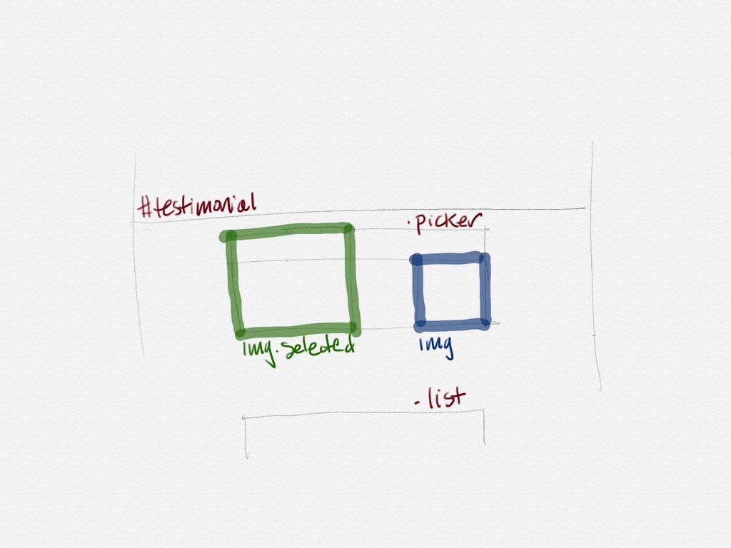
The first step is to break the design into pieces. I did a rough sketch of what I wanted on Linea’s bottom-most layer:

Testimonial Outline

So far, that’s pretty underwhelming. What’s the big deal?

Well, we’re about to encounter one of the three hardest things in computer science: cache invalidation and naming things.

Another layer for names

This is where Linea really starts to shine. Because it’s a hard problem, your first naming choices are rarely the best. If you’re like me, it usually takes a few tries to get the right ones. When you use a separate layer for your names, they’re super easy to change without wiping out the lines of the underlying outline:

Testimonial Naming

Because selecting colors in Linea is so easy, I like to highlight important names. While debugging the page, the two states of the img elements had a matching CSS outline.

It’s also when Linea starts to feel like a miniature whiteboard on your desk. The Touch Eraser is one of those things that is so natural that you use it without breaking your train of thought.

A notes layer above all

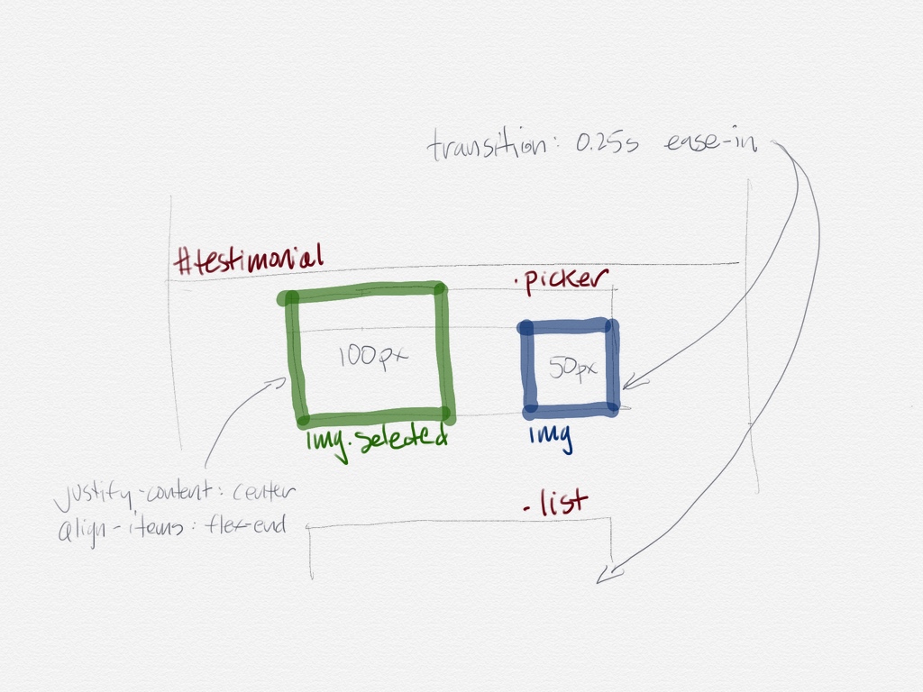
After getting the names you want, it’s time to start building! This is when I create another layer for things I want to keep track of. Again, you can add or remove notes without destroying the work on the other layers.

Testimonial Notes

My two favorite things in CSS are animations and Flexbox layout. And as much as I love them, you’ll see above that I can never remember the names of the timing functions or container properties.

(If you’re a web developer, take a look at the #testimonials source code on the Linea website: the images in the .picker Flexbox animate just by changing the CSS class on the <img> elements. Simple and elegant.)

Helping us stay organized

I also have a bad habit of keeping my drawings around forever — a lot of thought went onto the page and it’s hard to it throw away. Linea’s project management makes it easy to keep track of the old work and keep my desk clean.

It was a pleasure to learn that other developers are seeing the same benefits that I have. My friend Gus Mueller has this to say:

“Linea has been my go-to app for sketching out ideas and solving visual programming problems since the day I started using it. It’s now an indispensable tool for my work.”

My iPad Pro is still a great device for reading in a comfy chair, but now it makes a daily journey to my office. If you’re a professional developer, I bet Linea will become a fixture on your desk, too.

I invite you to take a look at the product website to learn more.

Sticker Accessibility

The popularity of Stickers was no surprise to us. What did surprise us was that these graphical elements are a hit with customers who have vision difficulties.

In retrospect, it makes sense. You want to let friends know that poo is hitting the fan even if you can’t see well. As always, Apple has thought about making their products accessible from day one, and the new features in Messages are no exception.

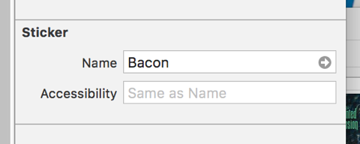
But it doesn’t work like you’d expect for the default apps created by Xcode. Take Parakeet’s excellent Snacks collection as an example. What would you expect to hear VoiceOver say with this configuration?

Bacon

Congratulations if you said “Bacon P-N-G Accessibility Label”. Technically, that’s the “same” as the Bacon.png file that was dragged into the Asset catalog, but it’s not what you or your customer expects. When you add “Bacon” in the Accessibility field as well, it’s read correctly and everyone wins. As you know, you can’t have too much bacon.

As for our own Sticker packs, we implemented custom view controllers and don’t suffer from this particular problem. We have identified some other small accessibility issues throughout our work and will be issuing updates soon. Parakeet will also be updating their release with improved labels.

If you’ve released Stickers for iMessage without Accessibility labels, we suggest that you do the same.

Tipping the Scales

If you’re an app developer, you’re already aware of how difficult it is to build a sustainable business. Yesterday, we tried something new.

The root of the problem is that frequent updates makes a better product and happy customers, but it also takes time and effort:

T5_Timeline

The code behind all those updates doesn’t come for free. And increasingly, our customers are realizing that the long-term viability of their favorite apps is at stake. The new tip jar in Twitterrific is the result of people asking how they can support our work.

The idea of patronage isn’t new. The success of this model depends on having a well established customer base who loves what you do. You also need to be careful about how you ask for people’s support: anything that’s annoying will do more harm than good.

If these prerequisites sound like they fit your app, I’d encourage you to give patronage a try. Don’t be afraid to ask for money from the people who value your work the most.