Tech
Spotify’s CarPlay app will soon act more like Apple Music
A new queue system is in the works.

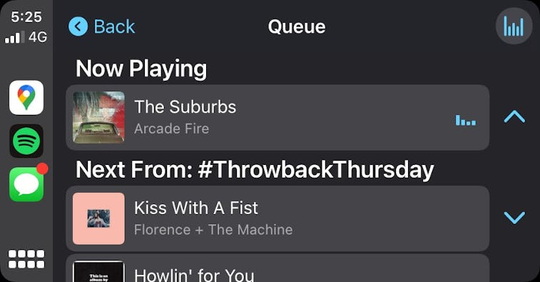
Your CarPlay options for your next car-cry are about to be more evenly matched to your vibe. As spotted by Shaun Ruigrok, Spotify’s CarPlay application is getting a serious update, according to 9to5Mac. A beta version of the app in TestFlight shows off a new queue system, not dissimilar to the Apple Music experience.
What to expect — The new interface allows users to view their queue without needing to use their phone. A “Go to queue” button will be included in the Now Playing screen for easy access to your upcoming songs.
The core UI will mostly remain the same, but it’ll get more colorful with this update. Album art and other colorful accents will dot the interface. The Home page will surface personalized playlists and daily news reports. It’s unclear when the general public will be able to enjoy the changes, but this beta version suggests we won’t have to wait for too long.
Breaking down the walled garden — Spotify has laboriously worked on voice-activated smart assistants only known as “Home Thing” or “Car Thing.” It also has its sights on the smart assistant working in its existing apps.
At first, the usefulness of a Spotify-specific voice assistant seemed limited, but with its recent introduction of lyric searching, the streamer could be close to catching up with the competitive smart speaker market sooner rather than later.
Spotify also most recently tested out standalone streaming for the Apple Watch before officially releasing it in November. Being able to more directly compete with Apple Music on Apple devices could help the company siphon away users from their integrated ecosystems.