The Future of Interaction, Part II

I am so fucking excited about SwiftUI.

I had strong suspicions that Apple was working on something like this, but what we’ve seen this week goes way beyond any of my expectations. My thoughts have now turned to how important this development will be for the future of all user interaction.

It all started while sitting at this year’s edition of The Talk Show and hearing about one of its sponsors: OmniFocus for the Web.

I’ve been good friends with the mad scientists at the Omni Group for a long time: we all have the gray hairs to prove it.

When you hear that they made a server with a macOS app that renders content for web, it sounds strange at first, but then makes a lot of sense when you consider how much code sharing you get. They’re not fools.

Then, while watching the SwiftUI Essentials talk, it occurred to me that the new domain specific language (DSL) looked like a HTML, CSS, and JavaScript hierarchy.

When you connect these two dots, you see a pretty exciting future for your code.

Abstraction

Apple has talked a lot about SwiftUI this week, but one thing has been conspicuous in its absence: implementation details. Some folks have discovered that there is some underlying UIKit code, but looking at this is a distraction.

The most important part of this announcement is the abstraction they’re working with, not the view surface being used for rendering.

This view abstraction is important for our apps: you don’t need to care how a button is rendered on tvOS, or macOS, or iOS. You don’t need to worry about which interactions are available on each platform, other than to provide alternatives when things like a digital crown aren’t available.

Interactions Above All

Earlier this week, I was talking to my friend Soroush Khanlou about the announcements. He expressed surprise that so many long-time developers who were vocal about Swift’s deficiencies were suddenly excited about SwiftUI.

There’s a simple explanation for this: we value great interaction, both at the user level and API level.

To me, it always felt like there was a parity mismatch between Swift and the existing UI frameworks. Sure, you can put a Ferrari engine in a Ford pickup and get it to move, but it’s not going to be a great experience. Awkward to build, awkward to drive around in.

The Web, Too

So my observation about the SwiftUI DSL and OmniFocus show us something important: a web browser is just another surface to render your views and respond to user actions or external events.

And it will be a way where interactions can be adapted for the platform being targeted.

Think about all the work that Apple has put into making iWork apps run in a web browser. Would they be looking for ways to make this easier? Yep.

I also think we’ll see the Swift community pick up on this DSL. Initially, it rubbed me the wrong way that Apple was using “Swift” in a framework that targeted platforms using proprietary features like Core Animation.

But again, when you look at the abstraction, you see the greatest value in how the DSL is processed, not in how it makes it into a CALayer. Could some enterprising group of developers take the SwiftUI DSL and produce something that worked on Android or Playdate? Certainly.

And what about compiling Swift code and running it directly in a web browser? You can do it right now.

The Most Capable Environment

While commenting about this on Twitter, Steve Streza made an important observation: SwiftUI is like a “reverse React”.

But I think there’s something important to add to his note: the SwiftUI DSL describes the most capable environment. It’s the maximum interaction surface: platforms will render and react to a subset of what’s declared.

Some devices, like a watch, will be capable of handling a physical rotation from a dial. Your only concern on other platforms, like iOS, are alternate interactions. When you target Playdate with your app’s SwiftUI DSL, you won’t be surprised to see the crank do the right thing.

I didn’t realize it at the time, but John Gruber’s quip at the beginning of The Talk Show hinted at our future:

For all of the consternation we have for developers who have web apps and put it in a shell and call it their Mac app, [laughter] the Omni Group has done the right thing and took their Mac app, and now it’s on the web.

It was certainly a funny moment, but it also gets directly to the point of working from a more-capable to a less-capable environment. And also how we’re at a point where our apps will head in directions that we can’t even begin to predict. I find that tremendously exciting.

In summary, I think that SwiftUI is an absolutely fundamental change that we’ll be living with for decades. You can certainly dismiss it, but doing so will be at your own peril.

The Future of Interaction

Shortly after finishing my treatise on Marzipan, I started thinking about what lies beyond. Some of those initial thoughts made it into a thread on Twitter.

This post can be considered an addendum or a hell of a long footnote: in either case, you’ll want to start by reading my thoughts on Marzipan. Because what’s happening this year is just the start of a major shift in how we’re going to build apps.

So while everyone else is making predictions about WWDC 2019, what you’ll find below are the ones I’m making for 2020 and beyond.

Update June 7th, 2019: It turns out I was making predictions for 2019, after all.

What is Apple’s Problem?

Before we get into thinking about the future, let’s look at a problem that Apple has today: too many products on too many platforms.

Historically, a person only had one computer to deal with. For several generations it was a mainframe; more recently it was a PC. One of the disruptive changes that started with the iPhone was the need to juggle two computers. Now we have watches generating and displaying data: another computer. Increasingly, the audio and video devices in our living rooms are added to the mix.

Syncing and cloud services help manage the data, but we all know the challenges of keeping a consistent view on so many machines.

If you’re an iMessage developer, you have to think about a product that works on iOS, macOS, and watchOS. You get a pass on tvOS, but that’s small consolation. The same situation exists in various combinations for all of Apple’s major apps: Music, Calendar, Reminders, Notes, Mail, etc.

It’s likely that all of these apps share a common data model, probably supported by an internal framework that can be shared amongst platforms. That leaves the views and the controllers as an area where code can’t be shared.

Marzipan is About Views

With this insight, it’s easy to see Marzipan as a way towards views that share code. A UIView can be used on your TV, on your desktop, on your wrist, and in your pocket. That’s a big win for developer productivity.

It’s also a win for designer productivity: you can share app design elements. We already see this in Apple’s cross-platform apps when colors in Calendar match, speech bubbles in Message have the same shape, and Notes shares a special glyph for the “A”.

Everyone’s excited to know what the Dark Mode on iOS is going to look like. My guess is that people who have been running a dark user interface on their Mac have already seen it. It’s hard to find a balance of readability and contrast with dark elements and I don’t see Apple’s designers making any major changes in next week’s announcement. There will certainly be refinements, but it makes no sense to throw out the huge amount of work that’s already been done.

I also see the Mac leading the way with techniques that provide a more vibrant interface and allow a customer to customize their device. The accent color in System Preferences would be a welcome addition in the iOS Settings app.

All of this leads to a common appearance across platforms. In the near future, we’ll be in a nice place where our architecture can be shared in models, and our designs shared in views.

That leaves us with one final problem to solve: how do we share our interactions and controllers?

The Arrival of New Interactions

Apple ties interactions to platforms and their associated hardware. The Mac has interactions that are different than iOS. And watchOS has ones that are different than iOS. On tvOS, you can be limited to four arrow keys and two buttons.

There are some interactions, such as a swipe, that appear on multiple platforms, but as a whole each platform is different. This approach lets the customer get the most out of the device they purchase.

As we start to think about how interactions are shared amongst platforms, it’s wise to consider new hardware might be arriving soon.

For the past few years, Apple has been putting a lot of effort into augmented reality (AR). And I have no doubt that this hard work is not for our current devices.

AR is a great demo on an iPhone or iPad, but the reality is that you can’t hold a device in front of your face for an extended period of time: your arm gets tired after just a few minutes. I made this argument over a decade ago when everyone was getting excited about multi-touch displays coming to their desktop. It still holds true because it’s a dumb idea, just like AR on a mobile phone.

Apple will solve this problem with new hardware. And these devices will run “headgearOS” with new and completely different interactions. If you’re that Messages developer, it means you’ll be writing new code for yet another platform. Yay.

There are other twists to this story: rumors about iPads with mice and Macs with touch screens. And let’s not forget about interactions with voice commands using Siri technologies.

It all adds up to a situation where the complexity of products is increasing exponentially as new devices and interactions are introduced. There has to be a better way.

How Not to Do It

Cross-platform frameworks have a long history of sucking. If you ever used a Java app during the early days of Mac OS X, you know immediately what I’m talking about: the interactions were from a different universe. The design of the system was a “least common denominator” where only a limited set of capabilities was exposed. It just felt wrong.

More recent attempts have had more success but they still fail to address the problem of ever-expanding interactivity.

Apple’s been down this road before and I don’t see them making the journey again. Instead, I see them taking a new and forward thinking direction. A bold and pragmatic change that Apple is famous for: they’d be setting themselves up for the next decade of user interaction.

So what could they do that no one else in the industry is doing?

Declarative Interactions

As Matt Gallagher notes, we’ve slowly been heading towards a declarative programming style.

Declarative programming is describing a system using set of rules and relationships. The rules and relationships cannot be changed during the lifetime of the system (they are invariant), so any dynamic behavior in the system must be part of the description from the beginning.

Syntactically, declarative programming is often about assembling a whole system of rules as either a single expression or domain-specific language whose structure reflects the relationship between the rules in the system.

Layout is an inherently declarative task. Layout is a set of rules (which Auto Layout calls “constraints”) that apply to the contents of a view, ideally for the entire lifetime of the contents. Constraint programming itself is sometimes considered a sub-discipline of declarative programming.

He pulls this together with his own experiences into a prediction about a Swift-only framework for “declarative views”.

Independently, John Gruber has made similar observations.

The general idea is that rather than writing classic procedural code to, say, make a button, then configure the button, then position the button inside a view, you instead declare the button and its attributes using some other form. HTML is probably the most easily understood example. In HTML you don’t procedurally create elements like paragraphs, images, and tables — you declare them with tags and attributes in markup.

In my opinion, limiting this thinking to just views and layout is short-sighted.

That’s because it doesn’t address the interaction problem with an ever increasing set of platforms. But what if this new framework not only let you declare views, but also the behaviors they enable?

The developer would describe the interactions an app supports. There would be relationships between those declared interactions. All this immutable information would then be processed by user interface frameworks. Your app’s behavior would be determined at runtime, not when it was compiled.

Think about how this would work using auto layout as a point of comparison. Until that declarative system came along, we all worried about frame placement. Now we just worry about the relationships between those frames and let the system pick what’s best.

With our interactions, we still have this tight coupling between a user action and app’s behavior. Tapping on a button or a swipe gesture invokes some code directly. A declarative interaction would be a layer of abstraction between what a customer does and how your app reacts.

Again, using auto layout to help form our thinking, what if there were “interaction classes” that functioned like size classes? Your iPad would behave as it always has until you plugged in a mouse. At that point, how you interact with the device adapts:

  • Controls could get smaller because of the increased pointing accuracy
  • Views could gain a hover state to display additional information
  • Drag & drop could change because it no longer depends on two fingers
  • A mechanical wheel could replace a finger for scrolling

This kind of adaptability would work across platforms – your app would behave differently when it was running in augmented reality or on a TV screen. As a developer you wouldn’t have to worry about what kind of hardware is available, you’d have to worry about what to do when a customer used it to perform a task.

I’m not going to predict how this would be accomplished. Yes, it could draw inspiration from React or other similar technologies. The only thing I’m confident of at this point is that Apple knows it has a problem and is working actively to solve it in a platform-independent fashion.

Marzipan is our first step. And what I’ve described above is Amber, the next step.
Software Survival

I just finished reading an oddly named book by someone you’ve probably never heard of – I loved it so much I’m writing this site’s first book review.

Ken Kocienda is a talented developer. He’s also a lucky one: he worked at Apple during the years when the Mac was reborn and the iPhone was created.

If you’ve ever opened the web browser in your pocket or typed a text message on a piece of glass, you’ve used his seminal work. Ken was directly responsible for two important parts of the original iPhone: a fast and efficient web framework and a keyboard that was both virtual and predictive.

Ken is also a great storyteller. His experiences during these formative years provide great material for this narrative. But more importantly, he extracts lessons from these tales that can be applied to our own efforts.

In short, Creative Selection is a study on how great products evolve that inspires the reader.


I first learned of Ken’s work during a presentation at WWDC 2014. A Strategy for Great Work showed that in addition to doing interesting things, he also took the time for introspection and learning from the work. I immediately followed him on Twitter and eventually discovered our mutual admiration! (That, in turn, led to the advanced copy I’m reviewing today.)

This talk, along with the ones that preceded it, feel like a formative process for the chapters of the book. The video linked above will give you a very good idea for the tone of his latest work, but there’s also an important difference.

Ken no longer works at Apple.

The end of presentation in 2014 alludes to this situation: not being able to talk about certain things is a fact of life in Cupertino.

I found Ken’s new freedom most intriguing when he focused on other people’s contributions to the secret projects. Every developer knows that a success involves many different talents and personalities. And with Apple’s penchant for secrecy, we never hear about these team interactions.


The collaboration between Steve Jobs and Jony Ive is not only well known, it’s well understood. I think this is because industrial design is much more concrete and easier to interpret in the formative stages.

Steve had another important collaborator, but that relationship isn’t as well understood. Creating software requires abstract decisions and a more opaque process. How do you make a button on a piece of glass?

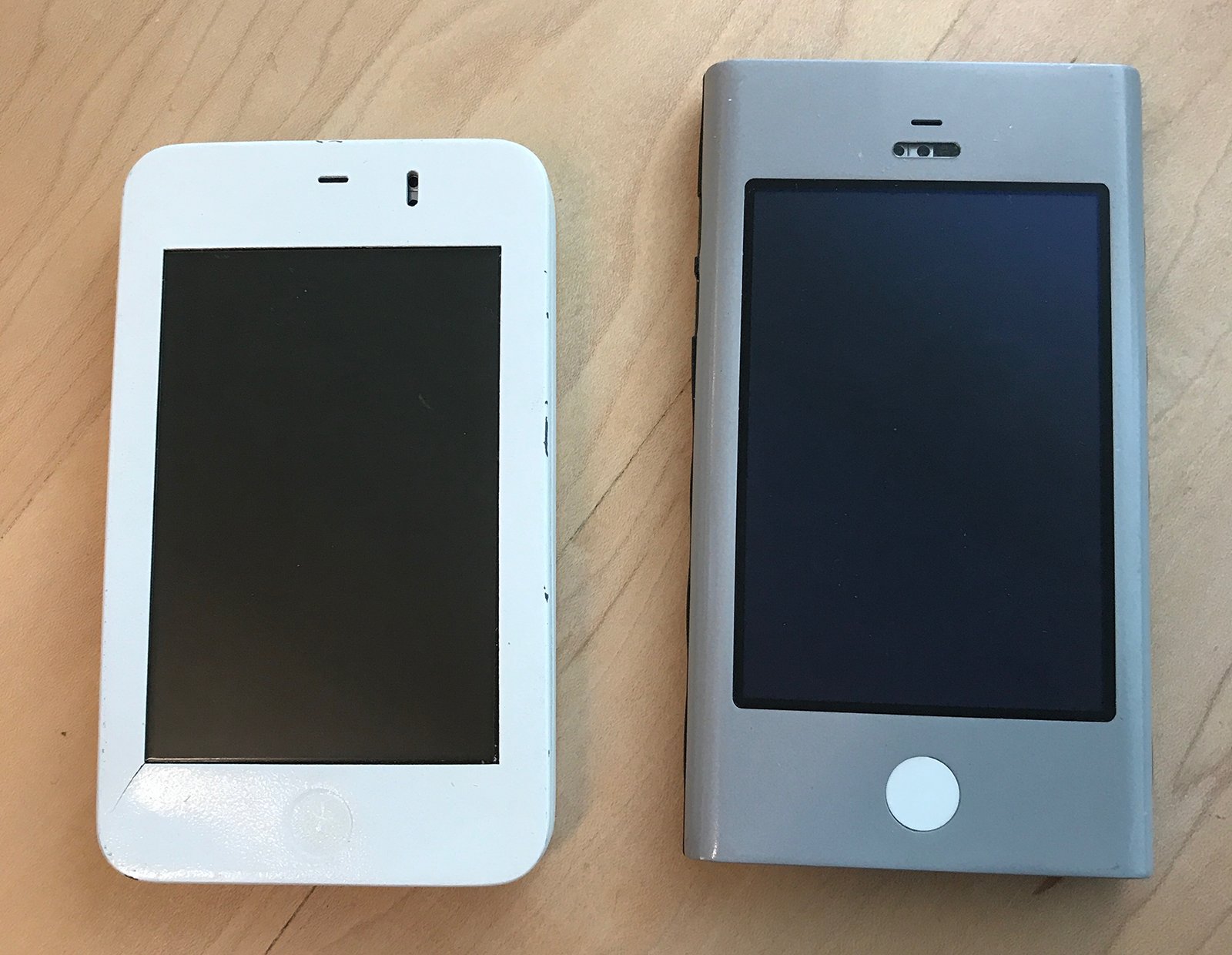
When you look at the Wallabies from Ken’s desk, you can see where the hardware is headed:

iPhone Prototypes from Ken Kocienda's desk.

When you think about what was on those screens, things get more complicated.

This book changed my view of Scott Forstall because it gave context to his work. Ken’s account breaks down the approach and shows how important Scott’s leadership was to Apple’s success.

Having Steve Jobs as a boss for your entire professional career would not be easy, but Scott handled it with great success. Even when that powerful mentor was asking for skeuomorphism.

The hardware would be lesser without Jony, and Ken shows that the software would be lesser without Scott.


If you’re a developer, you’ll find some passages a little slow going. That’s because you know too much :-)

As a great storyteller, Ken endeavors to make the topic as widely understood as possible. To achieve this he turns to analogies in cooking, sports, and the movies while describing the process of creating software.

While we may not need this high-level view, there is an important group that will benefit: our families. If you’re like me, you’ve struggled to explain what you do at that keyboard all day.

We all love our iPads and Kindles for reading, but I’m really glad I have a printed copy of the book to share with the people I love.


I’ve avoided spoilers in this review, but I’ll end with one story that touched me. When asked about the most important thing in development, I always answer with one word: empathy.

Ken links this concept, along with the combination of good taste, the philosophy of Immanuel Kant, and a discussion of atoms by Richard Feynman, all while explaining the choice of a QWERTY keyboard layout.

These complex factors enable a personal connection between people. Imagine being the developer whose choices led to the ability to send a quick message saying “Just landed.” Informing a loved one of your safe arrival transcends the importance of any line of code.

That is work to be proud of and we’re lucky Ken has taken the time to share it with us all.

A Tribute to iBeer

Today’s a big day for app developers.

In the lead-up to today’s event, I spent some time digging through my old purchases. After launching the App Store app, tap on your profile in the upper-right corner, then tap on the Purchased menu of your account page. After spending a few hours scrolling down, you’ll see your first apps!

One of the apps was something called “Carling Tap” – and I had no recollection of anything by that name. A little bit of research helped me remember that the app was formerly named “iBeer”. This hiccup with the name not only paused my scrolling: it also got me thinking about the importance of this early app.

Many of the apps on that first day, including my work with Twitterrific, were adaptations of desktop apps. Things like AIM, NetNewsWire, and Solitaire had many advantages on mobile, but in retrospect, they weren’t a sign of what lay ahead.

Even though it was a gag, iBeer gave us a real glimpse of our future. It was the first app that was spatial. The function of the app was determined by where it was in your world. It could not exist without you.

Since then we’ve seen many other apps take advantage of this unique characteristic of mobile devices. Ocarina made it beautiful. Ride sharing leveraged it for efficiency. Pokémon GO made it fun and communal.

Now we’re heading towards a future where all apps will be spatial. One can only imagine how that will turn out, but it’s likely that the accessories will be fun.

System Fonts in CSS

About three years ago, I wrote a piece on how to get system fonts in CSS. The San Francisco fonts had just been released and getting them onto a web page wasn’t obvious or easy. A recent tweet reminded me that I needed to update this information.

In my original post, I proposed the idea of a generic system font:

The “system” generic family name doesn’t currently exist, but I’d encourage browser manufacturers to adopt this technique.

Apple agreed and made a proposal on the CSS mailing list. Over the next few months that proposal evolved from being called “system” to “system-ui”. (Once upon a time, Windows used a font called “System” that could have caused a conflict.)

At the end of the day the CSS Font Module was updated and there was an official way to render text just like the operating system.

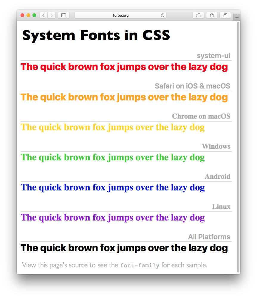
As every web developer knows, getting a feature into the spec is one thing and getting it into the browser is quite another. Luckily the adoption of system-ui has been quick. Both Chrome and Safari support it fully on a wide variety of platforms. Only Mozilla and Windows are lagging behind.

In many cases, you’ll also have to take backward compatibility into account — not every visitor has the latest & greatest browser. This CSS should cover all the bases:

font-family: system-ui, -apple-system, BlinkMacSystemFont, "Segoe UI",
    "Roboto", "Oxygen", "Ubuntu", "Cantarell", "Fira Sans",
    "Droid Sans", "Helvetica Neue", sans-serif;

(For more information on what those font names mean, see Marcin Wichary’s article in Smashing Magazine.)

If you’d like to see how this new generic font-family works, here’s a simple page that can be used to test any platform.

This whole process has been fascinating for me to watch. What started as a simple idea ended up being discussed and implemented by dozens of talented engineers. The result is a web that’s better and easier for a lot of folks.

Updated June 30th, 2020: Apple has added additional CSS classes for different types of user interfaces (starts at 14:25). The new font families, ui-sans-serif, ui-serif, ui-monospace, and ui-rounded allow you to get a specific faces of the system fonts (both in San Francisco and New York). These new families were introduced in Safari 13.1. For more information, check out the details of UI typography at WWDC.