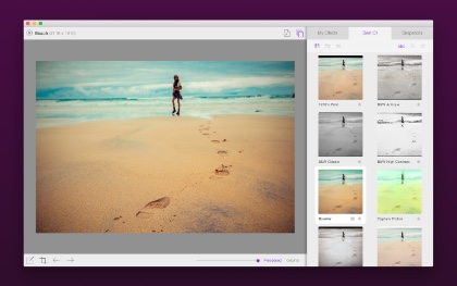
Blast from the Past

While watching this stunning video of data collected from NASA’s Solar Dynamics Observatory, it struck me that every ounce of energy on this planet originated from a nuclear explosion. That includes the gas in your car that was originally a dinosaur which ate plants that grew using the light from these solar explosions.

Whoa.

Fear China

I’ve been using the Internet in one form or another since the mid-80’s. In that time, I’ve seen a lot of strange stuff happening on our global network. On Tuesday, I experienced something extraordinary.

It all started with a text message from my partner Ged at 8:30 AM:

Mail server down. Please take a look when you can, thx.

I verified that the mail server was down from the west coast as well as the east coast, then started poking around to see what was wrong. When I looked at the server traffic, there was only one thing I could say:
daily

“Holy shit.”

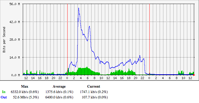
Unless you’re a network engineer, that graph won’t mean much. The data shown is the amount of bandwidth into the Iconfactory’s main server. The blue line is the number of megabits per second for requests and the green area is the amount for responses to those requests. Normally, the blue line is much smaller than the green area: a small HTTP request returns larger HTML, CSS and images.

The number of requests peaked out at 52 Mbps. Let’s put that number in perspective: Daring Fireball is notorious for taking down sites by sending them about 500 Kbps of traffic. What we had just experienced was roughly the equivalent of 100 fireballs.

If each of those requests were 500 bytes, that’s 13,000 requests per second. That’s about a third of Google’s global search traffic. Look at how much careful planning went into handling Kim Kardashian’s butt at 8,000 requests per second.

All of this traffic directed at one IP address backed by a single server with a four core CPU.

Like I said, “Holy shit.”

Regaining Control

The first course of business was to regain control of the server. Every service on the machine was unresponsive, including SSH. The only thing to do was perform a remote restart and wait for things to come back online.

As soon as I got a shell prompt, I disabled the web server since that was the most likely source of the traffic. I was right: things quieted down as soon as traffic on port 80 and 443 was rejected. It was 9:30 AM (and you can see it in the graph above.)

The first log I looked at showed a kernel panic at 3:03 AM in zalloc. This was right at the time of the biggest spike. The system.log showed similar problems: the high level of traffic was causing all kinds of memory issues caused by too many processes.

As a test, I turned the server back on for a minute and immediately maxed out Apache’s MaxClients. Our server simply isn’t capable of handling thousands of Apache child processes (it normally runs with less than a hundred.)

So where the hell was all this traffic coming from?

Triage

Since I knew the traffic was from the web, it was likely that Apache’s logs would tell me something. Given that our Apache logs are usually in the 10 MB range, the current 100 MB log file surely contained a lot of useful information.

The first thing I noticed was a lot of requests being returned with a 403 status code. The paths for those requests also made no sense at all: one of the most common began with “/announce”. But there was also a lot of requests that looked like they were intended for CDNs, YouTube, Facebook, Twitter and other places that were not the Iconfactory.

As a test, I updated Apache’s CustomLog configuration with %{Host}i so it would show me the host headers being sent with the requests. I then turned the web server back on for 30 seconds and collected data. Indeed, the traffic we were seeing on our server was destined for someplace else.

The CHOCK was pretty proud to be serving traffic for cdn.gayhotlove.com, but I sure wasn’t.

Clearly there was some kind problem with traffic being routed to the wrong place. The most likely candidate would, of course, be DNS. While looking at IP addresses in my logs, I noticed something interesting: all of this traffic was coming from China.

The pieces were starting to fall into place. I understood the problem:

(Note: The “GFW” in responses refers to China’s Great Firewall. I’m pretty good with acronyms, but this was a new one to me!)

Now all I had to do was find a way to deal with the traffic.

Apache Configuration

My first thought was to deal with the traffic was by handling the HTTP traffic more efficiently.

We host several sites on our server and use VirtualHost to route traffic on a single IP address to multiple websites. Virtual hosts rely on the “Host:” header in the HTTP request to determine where the traffic should head, and as we’ve seen above, the host information was totally bogus.

One thing I learned is that Apache can have problems figuring out which virtual host to use in some cases:

If no ServerName is specified, then the server attempts to deduce the hostname by performing a reverse lookup on the IP address.

Remember that millions of requests had a host name that would need to be looked up. After consulting the documentation, I setup a virtual host that would quickly return a 404 error for the request and display a special message at the root directory. Here’s what it looks like:

<VirtualHost _default_:80>
    ServerName default
    DocumentRoot "/Web/Sites/default"
    <Directory "/Web/Sites/default">
        Options None
        AllowOverride None
        DAV Off
    </Directory>
    LogLevel warn
</VirtualHost>

If you run a server, take a second right now to make sure that it’s doing the right thing when presented with a bad header:

$ curl -H "Host: facebook.com" http://199.192.241.217

All of this helped deal with the traffic, but it only slowed down the amount of time it took Apache to max out the child processes. A Twitter follower in China also reminded me that their day was just beginning and traffic would be picking up. At 8 PM, the trend for traffic didn’t look good, so I turned off the web services and had a very stiff drink.

Then something strange happened at 11:30 PM: the inbound requests started to die off. Someone in China had flipped a switch.

I was tempted to bring the web server back up, but experience told me to leave things as they were. Michter’s and bash don’t make a good pair.

This problem would have to wait for another day.

Hello BitTorrent

The next morning, I tried bringing up the web server. Things ran fine for awhile, but after 10 minutes or so, Apache processes started climbing again.

Most of the traffic was to the BitTorrent /announce URL. BitTorrent clients in China still thought my server was a tracker and were noticing that port 80 was alive again.

And it’s not like there are just a couple of people using BitTorrent in China.

The direct traffic from DNS may have gone away, but secondary traffic from cached information was still killing us. At this point, the only recourse was to block IP addresses.

Blocking China

I’m a big believer in the power of an open and freely accessible Internet: I don’t take blocking traffic from innocent people lightly. But in this case, it’s the only thing that worked. If you get a DDOS like what I’ve described above, this should be the first thing you do.

The first step is to get a list of all the IP address blocks in the country. At present that’s 5,244 separate zones. You’ll then need to feed them to your firewall.

In our case, we use ipfw. So I wrote a script to create a list of rules from the cn.zone file:

#!/bin/sh

# cn.zone comes from http://www.ipdeny.com/ipblocks/
#
# build the rules with:
#
# $ build_rules > /tmp/china_rules
#
# apply rules with:
#
# $ sudo ipfw /tmp/china_rules 

r=1100
while read line; do
	echo "add $r deny ip from " $line " to any in";
	r=$(( $r + 1 ))
done < cn.zone

You’ll want to adjust the starting rule number (1100 above) to one that’s before the allow on port 80.

After setting these new rules, traffic on our server immediately returned to normal.

Digging Deeper

Now that I had my server back, I could take some time to look at logs more closely and see if anyone else had seen similar issues.

First Hits

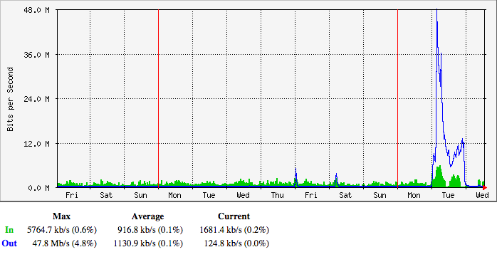
BitTorrent /announce traffic turned up a few clues. I had noticed a few 5 Mbps spikes in our request traffic late on Thursday, January 15th and on the following Saturday:
weekly

Initially, I just chalked it up to random bullshit traffic on the Internet, much like the packets from Romania looking for phpMyAdmin. In retrospect, that was dumb.

If you look at the origins of those first packets, you’ll see that it’s not a regional problem: the IP addresses are physically located all the way from densely populated Hong Kong to the remoteness of Xinjiang province (north of Tibet.)

Was this traffic a probe or an unintentional screwup? I don’t know.

(Note: I have archived all of the logs mentioned above. If you have legitimate reason to analyze these logs, please get in touch.)

We’re Not Alone

More concerning, is that other site owners are seeing similar behavior starting in early January. I took some comfort in knowing that we weren’t alone on the 20th.

But at the end of the day, every machine in China has the potential be a part of a massive DDOS attack on innocent sites. As my colleague Sean quipped, “They have weaponized their entire population.”

Conclusion

Will this happen again? For everyone’s sake, I hope not. The people of China will only end up being banned from more websites and site owners will waste many hours in total panic.

But if it does happen, I hope this document helps you deal with China’s formidable firehose.

Other Resources

If you’re using ngnix instead of Apache, here are some instructions for blocking BitTorrent requests from China.

For those of you using iptables on Linux, here’s a tutorial for blocking IPs on that platform. It’s also interesting to note that Matt’s site is running on Linode: don’t assume that big providers will offer any protection upstream.

This thread has a good discussion with other site owners experiencing the BitTorrent traffic.

Another option to consider is moving the server’s IP address. You’ll have to deal with the normal DNS propagation and reconfigure reverse DNS (especially if you’re running a mail server on the box), but this may be quick and effective way to avoid the firehose.

Updated January 24th, 2015: Added the section above with additional resources for those of you who are experiencing the problem. Good luck!

Updated January 28th, 2015: I’ve written some opinions on the incident described above.

Death by a thousand cuts

Dear Tim,

I’m writing today about the latest kerfuffle on the state of Apple’s business.

Marco is a brilliant developer and I’m proud to call him a friend. I also know that, like many of us geeks, sometimes his words verge on hyperbole.

You’ve always struck me as someone who relies on facts for your decision making, so I’d like to provide some background from a geek’s point-of-view. No hyperbole. No bullshit.

The reasons Marco’s piece got a lot of initial attention was because the basic message resonated with a lot of people in our community. But as usual, idiots with ulterior motives twisted the original message to suit their own purposes.

The good news is that none of the problems us geeks are seeing are show stoppers. We’re not complaining about software quality because things are completely broken. There’s still a lot to love about OS X and iOS.

But this good news is also bad news. Our concerns come from seeing the start of something pernicious: our beloved platform is becoming harder to use because of a lot of small software failures.

It’s literally a death by a thousand tiny little cuts.

Apple may not be aware of the scope of these issues because many of these annoyances go unreported. I’m guilty of this when I open a Finder window on a network share. While the spinner in the window wastes my time, I think about writing a Radar, but a minute later it’s forgotten. Until the next time.

As a developer, I know that Radar is my best channel to give Apple constructive feedback, but writing a report is a time consuming process. Those links above consumed about two days of my productivity. Nonetheless, I’ll keep harping on my 20K+ Twitter followers to do their duty. These problems won’t fix themselves.

I’m also wary of looking at past OS X versions with rose colored glasses: there always have been bugs, there always will be bugs. But I have a pretty simple metric for the current state of Apple’s software: prior to the release of Yosemite, I could go months between restarts (usually only to install updates.) Lately, I feel lucky to go a week without some kind of problem that requires a complete reset. I experience these problems on a variety of machines: from a 2009 Mac Pro to the latest Retina iMac.

A bigger concern than my own productivity is how these quality issues affect Apple’s reputation. Geeks are early adopters and effusive when things work well. But when we encounter software that’s broken, we have a tendency to vent publicly. Yesterday’s post by Marco was the latter (spend some time on his blog and you’ll see plenty of the former, as well.)

Because a lot of regular folks look to us for guidance with Apple products, our dissatisfaction is amplified as it trickles down. When we’re not happy, Apple loses leverage.

It also leads to a situation where your product adoption slows. To give you some personal, and anecdotal, examples:

  • Every holiday season, my wife and I make sure that everyone’s computer is up-to-date and running smoothly. This year, for the first time ever, we didn’t install the latest version of OS X. The problems with Screen Sharing are especially problematic: it’s how we do tech support throughout the year.
  • My wife hasn’t updated to Yosemite because others at her workplace (a large, multi-national corporation) have encountered issues with Wi-Fi. Problems like this spread like wildfire in organizations that are accustomed to avoiding issues with Microsoft Windows.

Before I close this letter, I’d like to offer a final observation. Apple is a manufacturing powerhouse: the scale of your company’s production line is an amazing accomplishment. Unfortunately, software development is still a craft: one that takes time and effort to achieve the fit and finish your customers expect.

Apple would never ship a device that was missing a few screws. But that’s exactly what’s happening right now with your software products.

I’ve always appreciated the access Apple’s executive team provides via email, so thanks for your time and attention to this matter. Please feel free to contact me for any further information or clarification.

Yours truly,

Craig Hockenberry

A day with Apple Watch

As every Apple developer knows by now, Apple Watch is becoming a reality. If you do nothing else right now, watch the video at that link: it’s a great overview of WatchKit that will only take a half hour of your time.

David Smith put it best: there’s a lot more here than most of us expected. I spent yesterday exploring the APIs and have some thoughts and links to share below.

Software Design

The local and remote nature of WKInterfaceObject feels a lot like the days of a dumb terminal talking to a mainframe. Except this time, the terminal ain’t dumb, and the mainframe fits in your pocket.

But still, there’s RPC going on here, and a lot of the design patterns and limitations are due to that fact. Our IBOulets and IBActions are traveling around in thin air: let’s take a look at what that means.

No customization

WKInterfaceObject inherits from NSObject, but don’t let that fool you. There’s absolutely no customization here: you can’t subclass WKInterfaceWhatever.

If you don’t believe me, try to set a Custom Class for one of the objects in Interface Builder. While this is a limitation, it’s also a good thing for a new platform: it forces consistency in the user interface. None of us have even held an Apple Watch before, so constraints will help us to not shoot ourselves in the foot.

One thing that some of us are wondering: why aren’t these classes that can’t be instantiated just protocols? Time will tell, I’m sure.

No properties

In a similar vein, these WKInterfaceObject classes aren’t like other UI objects we’re used to dealing with. There are no @properties, only setters. Why?

Querying a property would mean a round-trip over Bluetooth to get a control’s current state. It’s more efficient for your iPhone app to keep track of things instead of consuming power with a radio.

Object marshaling

When you set a property using an object, you may be fooled into thinking that object goes over the wire.

Look at UIFont in an attributed string, for example. If you try to instantiate one of the San Francisco fonts that you find in the SDK, you’ll be surprised that it returns nil. Remember, you’re creating this instance on an iPhone (where the font doesn’t exist) to use on a watch (where it does exist.)

I’m guessing that things like font instances are marshaled over to the device. At this point, it’s important to remember that an object you create may not be the one used in the user interface.

Images

Images are a large part of what makes a great looking app these days. We’ve gotten pretty good at it. Understanding how they work in WatchKit is essential.

It’s best to make your images static resources in the bundle that gets delivered to the watch. It’s expensive to transfer these large assets over Bluetooth. The best experience for the user is to pay that price at the time the watch app is installed.

To get an idea of the extent of this philosophy, download the Lister sample code and look in the Watch App assets for the Glance UI. You’ll find 360 images: one for each degree of the circle’s movement. Your designer is going to love making these images. j/k LOL

Still, there are cases where you’ll need to send images to the watch dynamically. Think about avatars for a social networking service: no amount of memory can hold all the images you’d need for Twitter.

This confused me at first, so I asked someone who’d know. The solution is to use WKInterfaceDevice to add images by name. These can then be used in WKInterfaceImage using the -setImageNamed: method. The image cache can hold up to 20 MB and is persistent across launches. Think of it as a way to dynamically extend the contents of the bundle you delivered during the install process.

Another approach is to create the image on the iPhone and transfer it directly to WKInterfaceImage using the -setImage: method. This is reasonably fast in the simulator, but I’ll bet money there’s a significant lag on the actual device.

WKInterfaceGroup

My first impression of the user interfaces you could design in Interface Builder wasn’t entirely positive. I could create designs that were functional, but I couldn’t personalize the layout. That all changed when I figured out how WKInterfaceGroup worked.

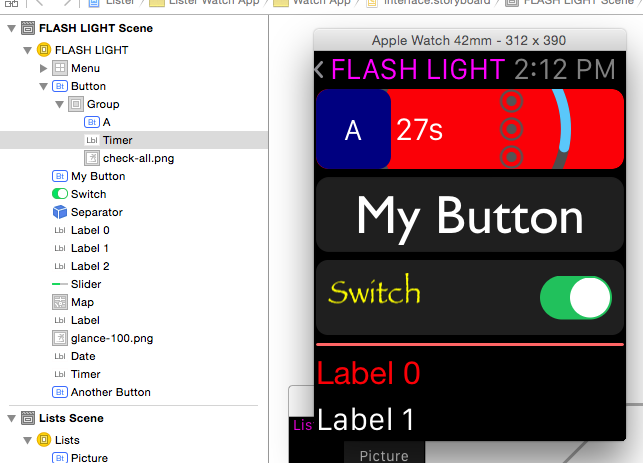
The light went on when I saw that a WKInterfaceButton had a content setting for “Text” and “Group”. When you specify “Group”, you get a container where you can place other items. It was only a matter of time until I ended up with this:

WKInterfaceGroup

The pretty part is the list of objects on the left, not my abuse on the right!

The topmost “Button” uses the group content mode, so it’s layout is defined with a container. That container includes three more items: another blue button with an “A”, a WKInterfaceTimer that counts down, and an image with the “check-all.png” graphic. The Group container uses a red background with another transparent image (the teal arc.)

The interesting thing here is that while you only get one IBAction for the button, you can set up multiple IBOutlets for the items in the container. As a test, I hooked up the button’s action to change the background color of the group, reset the timer, and swap one of the images.

In Interface Builder, the Size and Position settings in WKInterfaceObject’s Attribute inspector let you define where the items in the container are placed and how much space they should use. Since you don’t know if you’re going to be running on a 38mm or 42mm device, think in fractions. The example above uses 0.25 for the button and the timer, and 0.5 for the image.

Power Consumption

Bluetooth Low Energy must be really low power: the design of WKInterfaceObject means it’s going to be on a lot. Every interaction with the watch has the potential to move actions and data between your pocket and wrist using the radio.

But more importantly, this API design gives Apple a simple way to put a cap on power consumption. We saw this approach in the early days of the iPhone and that worked out pretty well, didn’t it?

One final thought about the API design: your code never runs on the watch.

Physical Design

In addition to new APIs, more information about the physical characteristics of the watch have been made available. We now know that the 42mm model has a 312×390 pixel display and that its 38mm counterpart uses 272×340 pixels.

Screen resolution

In addition to its size, the placement of the display on the face of the watch has been documented in the layout section of the Human Interface Guidelines. That has led some of us to estimate the screen resolution.

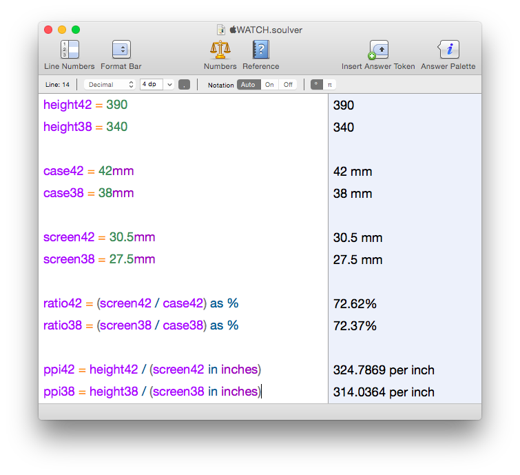
My calculations put the resolution somewhere above 300 ppi:

Soulver

Since we’re not dealing with engineering drawings here, it’s impossible to be precise. For one thing, we don’t know where Apple is measuring 38 and 42 millimeters. Traditionally, it’s measured from the center of the lugs, but since the Apple Watch uses a different mechanism, it could be the size of the sapphire crystal.

John Gruber, who has a stellar record at this guessing game, thinks the display will be 326 ppi, just like on the iPhone 6.

But you’ve got bigger problems than pixel perfect design now anyway…

Screen size

The display layout drawings give us enough information to create a reasonable physical facsimile of the watch.

It’s small. Very small.

Much smaller than you think if you’ve been looking at it in the simulator.

You’ll want to download this PDF created by Thibaut Sailly and print it out at 100%. My first thoughts were that my finger covered more than half the screen and that I could fit eight of these displays on my iPhone 6!

After this “physical contact” with the Apple Watch, some of the controls that we see in the simulator feel ridiculously small. There’s no way you’re going to tap the back arrow in the nav controller with your finger: I’m guessing that control is there solely for developers who are using mice and trackpads to develop their apps.

Mockups

Once you have the PDF to give you an idea of the physical size, you can then start to see how your design works at that scale. Thibaut has already made the world’s ugliest watch and it’s doing important information design work. Here it is showing a simulated scroll view and exploring glance interactions.

You can even take these mockups a step further and strap a phone to your wrist. While it may look and feel a bit strange, there are definitely some interesting insights being discovered in that Dribbble post. The Mirror tool in xScope could be very handy for this kind of work: design in Photoshop, view on your wrist and learn.

These physical interactions with your designs are incredibly important at this point. Wondering why the scroll indicator only appears in the upper-right corner while you scroll your view? I was until I realized that’s where the digital crown is physically located.

Orientation

One thing that none of us are going to miss in WatchKit: you don’t have to worry about device orientation changes.

As my friend, and party pooper, John Siracusa points out, this is probably just a temporary situation. As a fashion accessory, Apple Watch could easily become a pendant watch.

Where to go from here

So there you have it: a day spent with another revolutionary set of APIs. If you’re just starting out, the links to the HIG and sample code above are great places to start learning.

If design interests you as much as code, you’ll also want to download the Apple Watch Design Resources (the link is at the bottom of that page.) You’ll find all the fonts and Photoshop documents you need to start pushing pixels. But as you saw above, make every effort to put those pixels into physical perspective.

As Apple has stated, this is only the initial phase of the API rollout: fully native apps will be possible later this year. Even though this is a first step, it’s a really good one.

All that’s left to do now is start making awesome apps.

FLASH_LIGHT

Behind The App: Flare 2

Here’s what I’ve been pouring my heart and soul into since the day WWDC 2014 ended: Flare 2.

We started working on this project well before WWDC. A significant redesign that put content first had been completed. A lot of code had been written and the app was working well.

But…

WWDC was a cornucopia for developers. There were suddenly so many new things we could do on both iOS and OS X. It was overwhelming and exciting at the same time.

And…

Three things stood out for us: the new look for Yosemite, iOS 8 extensions, and CloudKit. We had always wanted to do something with Flare that needed these things. It really felt like we won the Apple developer lottery.

We could now create great photographic effects on our Macs and apply them to the photos taken with the camera that’s in our pocket. Perfect. Simple.

But even with a simple and perfect goal, execution is never easy. I think there’s always a lot to learn by looking back at the struggles you encounter during product development, so here are some things Anthony, Talos, Travis, Wolfgang, Sean and I encountered during our journey.

Yosemite’s User Interface

The Flattening

As I noted above, we’re acutely aware of the direction that OS X and iOS user interfaces are heading. We’ve been striving to put content first for a couple of years now. This effort started with Twitterrific 5.

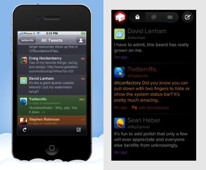
Note the date of the post in that last link: December 2012 was six months prior to iOS 7 and “flat user interfaces” being announced at WWDC 2013. While everyone else was making interfaces like the one on the left, we created the one on the right:

Twitterrific

Click on the image to see a bigger version

We saw the same opportunity to simplify Flare. It was possible to create an app that put the customer’s content frontmost while retaining advanced controls to adjust the photo when needed.

This is where we were at on May 28th of this year. Anthony’s mockup was already very flat and content-centric:

Twitterrific

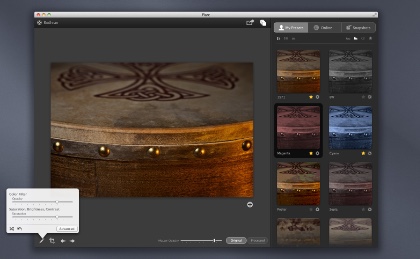
Of course, after WWDC we realize we could do even more to simplify the user interface. Here’s how the final product turned out:

Twitterrific

(If you’re at all interested in interface design, I suggest downloading a copy of Flare just to try it out. There are a lot of animations and other effects that can’t be expressed in static screenshots.)

As a company, designing and implementing a user interface for Yosemite is a very important exercise. We have clients who want us to help move their apps in a similar direction, and the only way to become an expert with this stuff is by making it.

Here are a few observations from the “Yosemitification” of Flare. (And yes, we used “Yosemitify” frequently in our internal discussions!)

Tint & Themes

The influence of iOS 8 goes beyond the flatness of the design. We wanted to use control tint color to give the user feedback on the state of the application. The tint color also gave us a visual anchor between the two platforms were Flare runs: the purple tint links the user interfaces on iOS and OS X.

Unfortunately, OS X only supports the notion of two tints: blue or graphite. In the end, we wrote our own control cell classes that used a custom tint color. I’m hoping to have the time to open source this code some day: many products besides ours are embracing multiple platforms and these controls will be very helpful to other developers.

Another subtle touch in the Flare user interface: it supports both the light and dark themes in Yosemite. The theme support in Yosemite allows you to change the entire control hierarchy’s appearance at any time. We use this capability as another way to put the customer’s content first: sometimes their photos look best on a black background, other times a white background.

Vibrancy

There was a very common theme throughout Flare’s development. We would add vibrancy to the interface, and then a couple of weeks later, we’d remove it.

Personally, I think it’s a lovely and subtle effect. But it’s just too easy to use it in a way that interferes with usability. Text and other lightly stroked information (such as icons) can disappear on the subtly colored gradients that you have little control over.

The last vibrant holdout in Flare was the header at the top of the list of effects. In fact, we removed it the day before the app was submitted for review! The thumbnail images looked really cool sliding up underneath a transparent header, but since we don’t have control of the content generated by the thumbnails, it was much too easy to have colors that rendered the icons and text unreadable.

(In the screenshot above, you will notice a slight color shift between the header and the thumbnail content that’s not in the final product: the screenshot was created before we removed the visual effects view.)

Vibrancy does still have a place in our app. It works great in the “guided tour” for displaying help over the content and controls of the interface. This guided tour is also a piece of UI that we’re all very proud of: we wish we could sit down with every customer and say “Hey, look at this!”, but this tour is a really great alternative.

iOS 8 Extensions

Tools

Let’s just say things were a little rough development-wise at the beginning. Extensions are an awesome addition to both OS X and iOS, but as with anything new, they were also fragile. At one point, the only debugging tool was my old friend printf(). Not having Instruments available to track down memory leaks makes you appreciate the awesome power of that tool.

As new versions of Xcode came out during the iOS 8 beta, the situation improved steadily. This is why they call it the “bleeding edge.” I just want to know why I always forget this when starting out with something new and shiny :-)

I’ll have some more to say about these tools in the very near future: I’m working on a field guide for iOS extension development.

Memory

As someone who developed an app on the original iPhone using iOS 2.0, I didn’t think there would ever again be so many problems with managing memory. I was wrong.

Creating the Photos Extensions in Flare Effects was a huge challenge. First off, the most recent cameras have very high resolution. For example, the native size on my iPhone 6 is 2448 x 3264 pixels. That’s over 20 MB of source data you need to deal with.

These big images are being handled in an XPC process that runs at the same time as the Photos or Camera processes. You’re not the only one who’s dealing with a lot of pixels.

Compounding this is the fact that you usually need several of these big images around for compositing and other effects. Luckily, a lot of the magic in Flare (and iOS 8 in general) is done with Core Image, so a lot of the heavy memory requirements can be offloaded to the GPU via OpenGL ES. But even then, you have to be very careful: a post on Stack Overflow about managing textures across thread boundaries, literally saved our ass. I owe Max a beer.

Wolfgang did some amazing work to get our very complex filters running smoothly on iOS. Despite the APIs for Core Image being nearly identical between OS X and iOS, the data and parameters you feed the filters have very different requirements. Textures, scaling factors, extents and many other things had to be adjusted for the new platform!

The situation with memory was a constant struggle. In fact, it was even an issue after we had the app approved and ready for sale. We discovered a crashing bug that only happened on the iPhone 6 Plus because it needed a @3x preview image that weighed in at over 20 MB! Rejecting a binary and resubmitting for review the day before an Apple Event is not for the faint of heart.

CloudKit

As developers we often complained about the opaqueness of iCloud. Things would happen and you’d have no idea what was going on behind the scenes.

With CloudKit, that all changed. We’re now responsible for every little thing. Every response, every error, every piece of data. That’s a good thing, but the age-old fact remains: syncing is hard.

Luckily, my colleague Sean likes hard problems and built a syncing system that “just works”. Even then, we’re a little afraid we haven’t covered all the bases: just before submitting the app for review, we discovered an issue where expired tokens weren’t being handled correctly (because we’d switched from the development servers to the production servers.) To be honest here, our fingers are still crossed as we deploy this to millions of potential customers.

Still, the flexibility and breadth of this new API makes it all worthwhile. It makes it possible for us to get cool and free photo effects to folks on iOS even if they don’t use our Mac product. Doing something like that prior to iOS 8 and CloudKit would have been cost prohibitive from an infrastructure point-of-view.

Conclusion

So there you have it, a roundup of all the fun stuff that went into making Flare 2. We hope you enjoy it!