Behind The App: Twitterrific 5

I’ve always loved shows that take you behind the scenes of creative efforts: Project Runway and Classic Albums being two of my favorites. Here’s one about the development of Twitterrific 5.

Since a lot of the people reading this aren’t developers, I’m going to keep the jargon to a minimum. You’ll be able to enjoy this piece even if you don’t know what an Xcode is.

Statistics

To get an idea of the scope of the project, and see who worked on it, let’s look at a few numbers.

The first source code file was created on February 15th, 2012. Since that first check-in, there have been 2032 changes resulting in 824 files. Of those files, 73% are source code, 25% are images, and 2% are other assets such as fonts and sounds.

Sean Heber was responsible for 976 changes, while I came in second with roughly half as many (557). Tyler Anderson made 397 commits and David Lanham followed that with 95. Anthony Piraino and Gedeon Maheux picked up the rest.

We did weekly beta releases between October 26th and November 19th. The following day, we submitted the build to Apple for approval, which happened one week later. The app was released today, which is actually yesterday in Japan. :-)

Twitter Changes

If you’re at all interested in Twitter’s development ecosystem, you know that approximately six months into our product development there were some major changes announced.

In August, a posting on Twitter’s developer blog announced that changes were coming. In spite of the new requirements and limitations, we were happy to know that our API access wasn’t going to be revoked. Since the early days of the project, we had been worried that third-party development might be eliminated completely.

As more details about API 1.1 became available in September, we became even more upbeat about the changes. There were a lot of improvements in the API and the new infrastructure was extremely robust. Adapting our existing code to the new API took very little time and allowed us to simplify a lot of our internal code. It’s good to know that management’s decision to control the core Twitter experience hasn’t affected their great API engineering.

At this point in time, we also learned that we had plenty of user tokens for the upcoming version. We agreed with our friends at Tapbots, there is no reason to panic.

One downside to the limit of user tokens is that we can’t afford the “cost” of a free app. If someone downloads a free version of Twitterrific and then uses it once, we can never reclaim that token. Tokens are a scarce resource that developers have to manage carefully in order to recoup their development costs. If you’re holding out for a price drop with our app, you’ll be disappointed. The price of Twitter apps is going to rise from now on.

Development Approach

So when you have five people working on a piece of software, how do you go about it?

This time around, we took a much more design-centric approach. When you have a large project, be it a movie or a piece of software, you have to have someone calling the creative shots. For Twitterrific 5, that person was David Lanham.

We’d done Twitter clients before and honestly weren’t that enthused about doing another one. That was until we saw a complete and clickable prototype that David had created. That “wow!” moment you have when you launch and start to use Twitterrific 5 is something we experienced last February. We all knew we had to make this real, even if it was a bit crazy. Our foreman, Gedeon Maheux, made the call and the project began.

Some natural pairings occurred between the three developers and single designer.

As senior developers, Sean Heber and I decided to split the workload between the front-end and the back-end. Sean had a part in everything you see on screen. I had a part in everything you see going over port 443 (for you non-developers who won’t get that joke, that’s the secure network connection that the Twitter API uses.)

This turned out to be a great decision. The user interface doesn’t depend on knowledge of how data is transported over the network, processed and then cached in a database. In fact, in the early stages of the project, much of our back-end existed as a separate project with no user interface. It used automated tests that exercised multi-threaded access to the Twitter API. This independence between the UI and the network services allows new APIs to be added quickly and easily.

(AND IT MAKES ME KING OF THE BACK END IF YOU KNOW WHAT I MEAN)

One of the benefits of writing your own version of UIKit is that you have a pretty complete understanding on how to use it effectively. All the sexy animations and views you see in the the app are Sean’s doing. As he continued to amaze us all, we came up for a word for what he does: juice. For example, just the other day, he closed an issue titled “Add JUICE™ to Photo view”. (You’ll see that change in the 5.0.1 release that’s in review now, and yeah, it’s great.)

Splitting the front and back-end work between Sean and myself had another benefit: we were constantly optimizing our code so that it would make the other guy’s code work better. A lot of people have commented on how fast Twitterrific feels: hundreds of iterations made that happen.

Another pairing was between David Lanham and Tyler Anderson. From the start, we knew that we wanted customers to have control over the appearance of their timelines. Since Sean had done of version of UIAppearance proxy in Chameleon, that was a natural choice to accomplish our goals.

What happened next though, surprised us in a very good way. David started using Xcode.

Since Tyler was writing code that allowed all the appearance modifications to be collected in a single file, it was easy for David to go into that file and tweak the settings to get things exactly as he wanted. Any coder who’s worked closely with a designer had heard these phrases: “Can you replace this image?” “Tweak this color please!” “Nudge that button to the right a few pixels.”

Instead, David was adding files to Xcode and modifying UIColor and UIEdgeInset definitions by himself. Letting the designer take control of his designs, do test builds, and refine the interface produced some amazing results. And it let our developers focus on what they do best: typing code.

As work progressed on the product, we realized we were making something special. When that happens, all sorts of crazy and wonderful things start to form without you really knowing how or why. The best example is when Sean and David added gestures. Twitterrific was already in beta at that point and we were completely happy with the action menus, but the two of them went quiet for a couple of days saying only they were working on “something cool”. And they were right: we can’t imagine using the app without gestures now.

A Clean Slate

So now that you’ve heard about what led up to today’s release, let’s finish with some thoughts about future directions.

As soon as you launch Twitterrific 5, you’ll realize that it’s a clean slate. The visual design is obviously a fresh start, but everything under the covers is as well. When presented with a clean slate, you’re very careful what goes on it. It’s best feature is simplicity. I wrote about Gruber’s First Law of iPhone Development four years ago:

Figure out the absolute least you need to do to implement the idea, do just that, and then polish the hell out of the experience.

That still holds true, and we feel like we’ve done the least and polished the most.

We are well aware that people are going to complain about missing features: push notifications and streaming are obvious examples. But so are trends, and video support, and in-line photos, and… well none of that matters. We believe in building opinionated software.

The product you have in your hands is what we wanted and needed it to be. As the tagline on the website says, “A simply beautiful way to tweet.” We achieved that goal.

Personally, I find myself actively disabling notifications in most of the apps I install these days. Notifications are great when used in moderation, but it’s very easy to use them to the point of distraction. Since I read Twitter as free time permits, I don’t need a reminder. Similarly, a constant flow of streaming tweets interrupting my day sounds more like a bug than a feature.

But guess what? That doesn’t matter either. I’m just one of the opinions that made this software.

And now we’re going to start listening to our customer’s opinions. We’re all excited to get feedback from a larger audience and see how that fits in with our new minimalist vision. If you think Twitterrific is good now, just wait until you see what happens with your collaboration.

The First Apple Channel

Dear Tech Media,

While you’re looking for meaning in the shadows of an Apple press invite, you’re missing something important: Apple is producing content for its own distribution channel.

For the month of September, Apple is letting customers view live shows through a combination of apps, the web, and Apple TV. It’s the fourth year of the iTunes Festival in London, but this is the first year that it’s been broadcast via iTunes.

Why is this important? Let’s look at what this means for the various players involved:

Artists

As an app developer, I know what it’s like to be featured by Apple in one of its promotions. It sells a lot of product. And that, in turn, funds our creative efforts.

I’m sure the featured artists will gain fans as a result of their performances. I’ve watched a few shows and have already seen some bands that I’ll be keeping my eye on.

A lot of these artists are also probably working with Apple for the first time and getting a feel for what a more direct relationship with a distributor feels like.

Customers

As a customer, I’m all too familiar with the hassles and restrictions on digital content. It’s an eye opener to be able to play this content wherever and however I want. No crap, just good shows.

Tickets for the events are also free: seeing your favorite band in a small venue where all you have to buy are the drinks? Sign me up!

Apple has chosen the artists wisely. I couldn’t care less about some of the bands, but you should have seen my niece’s eyes light up when I told her that she could watch a free One Direction show on September 20th. Talk about keeping your customers happy!

Media Industry

The iTunes Festival shows everyone above what a world without a middle man would be like. We’re loving it: they’re fearing it.

Apple

You need an iTunes account to view these shows. If you didn’t have one already, you’ll certainly get one to see your favorite band.

The best viewing experience for these shows is on a $99 Apple TV. That’s less than the cost of a couple of tickets to see the big name acts. The drinks aren’t watered down, either.

It also sets a precedent for the future. Could this be akin to HBO creating premium content for it’s subscribers? Or Netflix producing its own shows to make it’s streaming service more desirable?

Apple first got its feet wet in the content business with music in iTunes. What we’re seeing here may be the company’s first effort in the video business.

Updated September 6th, 2012: I’ve heard from several sources that last year’s iTunes Festival was an iPad-only app (with AirPlay capabilities.) Apple has taken small, calculated steps with the Apple TV platform and this is another example of that approach.

Responding to App Store Reviews

When developers talk about wanting to respond to reviews, many of them haven’t thought through the social implications of what that means. Matt Gemmell has. As Marco Arment points out, replying publicly also leaves iTunes (more) open for abuse by unscrupulous or uninformed developers.

One idea I’ve had is giving developers the ability to add a support link to a review. This helps both the developer and customer in several ways:

  • The customer who reported the problem could be notified that a support link was added to their review and would be directed to a site which is designed to help them out. This could also lead to direct contact if there are other issues to be resolved.
  • Potential customers that are reading reviews can see how a developer responds to problems. If you come across a product with lots of support links, you know that’s a developer who cares about his customers.
  • Putting customer service front and center in iTunes makes it desirable for developers to create and maintain sites that provide helpful information. There are far too many products where the customer support link just goes to a product page that’s unhelpful.

Of course, restrictions would be needed to prevent abuse of these external links. For example, Apple could decide to only allow links to a developer’s support domain. There could also be limits on the number of support links a developer has at their disposal (like promotion codes, we would then use them judiciously.)

Finally, these thoughts only cover the information we exchange with the customers publicly. I still think there are cases where private contact via email is vital.

The Rise and Fall of the Independent Developer

I’m old enough to remember a time before the Internet. I know what it’s like to develop software both with and without a worldwide network.

Little has changed with the process of software development since the 1980’s. Of course there have been improvements in our tools and techniques, but the basic act of creating software products is much the same. What has changed dramatically in the past 30 years is how we distribute our creations.

In the days where software was distributed on magnetic media, such as reels of tape, cassettes, or floppy disks, it cost a lot of money to get the product to a customer. As a result, large companies and software publishers were the only ones with the financial resources to get these applications into a retail channel. There were very few independent software developers; and those who did exist were very small operations.

Then along came the Internet and everything changed. Distribution was suddenly cheap.

I remember a conversation with my good friend Cabel Sasser a few years ago. He and I were reminiscing about our first foray into online distribution and were surprised that we had the same initial reaction: “Holy crap! We can put our software on the Internet and people will actually buy it!”

Many other developers had this same experience and began leaving large companies to work on their own. Making a good living while having the freedom to work on their passion was a great life.

Now distribution is going mainstream with the App Store. And it’s already begun changing the lives and businesses of independent software developers. On the surface, it all looks good. There are more customers, increased revenues, and many great new products.

But this expanded distribution is also putting our business at risk: there are people in this new market who claim a right to a part of our hard work. Either by patent or copyright infringement, developers are finding this new cost of litigation to be onerous.

The scary part is that these infringements can happen with any part of our products or websites: things that you’d never imagine being a violation of someone else’s intellectual property. It feels like coding in a mine field.

From our experience, it’s entirely possible that all the revenue for a product can be eaten up by legal fees. After years of pouring your heart and soul into that product, it’s devastating. It makes you question why the hell you’re in the business: when you can’t pay salaries from product sales, there’s no point in building it in the first place.

So, just as in the days of magnetic media, the independent developer now finds him or herself at a point where it is again becoming very expensive to distribute their products to a mass market. This time the retail channel itself is very cheap, but the ancillary costs, both financially and emotionally, are very high.

And, of course, only large companies and publishers can bear these costs. My fear is that It’s only a matter of time before developers find the risks and expenses prohibitive and retreat to the safety of a larger organization. We’ll be going back to square one.

Over the years many of the top selling apps have been created by independent developers, starting with Steve Demeter and Trism at the App Store launch, and continuing to this day with titles like Tiny Wings by Andreas Illiger.

Losing that kind of talent and innovation to a legal system is the real crime.

Great writing, terrible reading

Apple has recently released Xcode 4—a major part of this release is an overhaul of the user interface. Change in your development environment is always a bit disruptive, but overall I think the move towards a single-window environment that adapts to different working modes is a good thing.

But this post is not to debate these changes to the programming environment. Rather, I’d like to discuss the new documentation viewer and how it has become unsuitable for both Mac and iOS development.

Apple’s technical documentation has always been top-notch: well written with just the right amount of technical detail. Unfortunately, the documentation viewer that we use to read this valuable information has been declining in ease of use over the past few releases.

It has gotten to the point where frustration with usability overshadows the excellent content. The best way to describe these annoyances is by example: I often get the feeling that the writers who create this prose don’t understand how we use it. Hopefully, this critique will help Apple create a viewer that’s just as good as the information it holds.

A corrupt index

A developer coming from Xcode 3 will have a terrible first experience with the new documentation viewer. Any previously installed documentation sets are incompatible with Xcode 4. Methods that you know exist just don’t show up:

Search in vain

There are also problems with the Jump Bar navigation stack not being recorded correctly and the browsing history being unavailable (the back button isn’t available when it should be.)

Presumably, there is a corrupt or incompatible index. The workaround is to delete and re-install the documentation set, but this is far from obvious.

Since I currently have three different versions of Xcode installed (and will continue to use Xcode 3 for the foreseeable future), I’m wondering if this corrupted/incompatible index will continue to be a problem. Fingers are crossed, but at least now we know what to fix if it breaks.

Popup hell

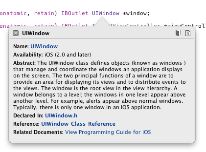
When you hold down the option key and click on a symbol in Xcode, you see the following window:

Popup hell

For novices, this window has some utility—it provides a simple way for them to dig into what is probably unfamiliar territory (“What’s a UIWindow anyway?”).

The problem is that this window becomes a roadblock for experienced developers. We know damn well what a UIWindow is: we need to dig into the details of this important class. Maybe we want to know more about the rootViewController instance or look at some of the methods in UIResponder (because we know it inherits from that.) This helpful popup quickly becomes a hindrance.

In previous versions of Xcode, holding down the shift key along with the option key gave you a quick way to avoid this popup help. In Xcode 4, that shortcut is gone.

Considering that this feature can get in the way hundreds of times per day, this is truly popup hell.

rdar://9149588

No methods

Once you get the documentation index in working order and actually make it past the popup help, your next hurdle is to locate the information you seek. Let’s say we’re looking for some background on what happens when a new -rootViewController instance is assigned. We’ve got the page of documentation, but there aren’t any controls to show the methods for the UIWindow class:

No methods

Besides being a pain in the butt, this is wholly inconsistent with the behavior in the code editor:

Methods

(Note that typing “ro” is enough to select “rootViewController” in the code editor’s popup menu. That, followed by the enter key gets you to the code of interest.)

From a developer’s point-of-view, the header files and the documentation page go hand-in-hand. Make the UI affordances the same and we don’t have to think about whether we’re looking at code or the words that describe it.

With a little more digging, you’ll find that you can get to the rootViewController documentation with the Jump Bar. Unfortunately, it takes a lot more effort than in the code editor: you have to click on the class name, and then move the mouse until the subcategories appear. Choose “Instance Methods” and wonder why rootViewController isn’t there. Then move the mouse back and try Properties.

Bingo (but you don’t feel like a winner.) And forget about navigating these lists quickly and easily with the keyboard as you can with the code editor.

rdar://9149638

Unmanaged complexity

Our final navigation problem is reading chapter-based documentation. These are the crown jewels of Apple’s developer documentation. Titles like The Objective-C Programming Language, iPhone Human Interface Guidelines, and the Cocoa Fundamentals Guide are essential reading for all developers, both beginner and advanced. As I began learning about Xcode 4, of course I turned to the excellent User Guide.

These guides typically span many chapters when sections that cover a wide range of topics. And this is how you navigate through those chapters:

Unmanaged complexity

Managing complexity, indeed.

The pity here is that someone in developer documentation has forgotten that a Table of Contents tells a much more important story than the individual chapters. A roadmap lets you visit the destinations efficiently.

To get an idea of how painful this is, try finding the recommended Singleton implementation in the Cocoa Fundamentals Guide using the Jump Bar. I’ll wait. (For extra credit, count how many menus you open in the process.)

Of course the documentation viewer has a search function, but even that’s a bit laborious because you have to click on a lot of disclosure triangles to find the right item in the results. Why aren’t the relevant results opened automatically? (And, yes, option clicking the disclosure triangle can be used to achieve this goal, but the question still remains: why isn’t this the default action?)

Updated March 29th, 2011: Matt Neuburg has discovered that for some documents, search results don’t show where your term occurs; you’re shown a higher-level page, but not the actual page.

The root of the problem here and with the method names in the class documentation, is that a deep hierarchy is too hard to navigate. Present the information in a single list and it becomes much more useful. Imagine how bad the code editor navigation would be if it presented a hierarchy based upon classes, properties and methods. It’s flattened into a single menu for a reason: and those same reasons exist in the documentation viewer.

The Jump Bar is a great addition to Xcode, but it’s true power lies in having a predictable end point. With code, that end point is a function, property or method. With documentation, that end point is elusive: it varies depending both with the type and the structure of the documentation you’re viewing. And that’s a real problem when you’re looking for something.

rdar://9149683

ePub, not PDF

While we’re on the subject of this long-form documentation, why isn’t more of it available in the ePub format used by iBooks? It’s pretty safe to assume a huge majority of Mac and iOS developers have an iPad and like to use it for technical documentation. Searching for “Apple Developer Publications” in iBooks results in only six books. That’s a great start, but there is still a lot of documentation available only in PDF.

PDF is, of course, an option for iBooks. But turns out to be unsuitable because there is no back button. If you click a link in the PDF file, it’s a one way proposition. And for technical documentation, that’s a deal killer.

ePub also has the advantage of better font control and image viewing.

rdar://9149845

Some good news

Fortunately, it’s not all bad news. This new version of the documentation viewer seems to keep track of its place on the page much more reliably than in the past. Gone are the days where hitting the back button put you back as the top of the page (instead of the method or property you were looking at previously.)

This one simple fix will save developers a huge amount of time. Thanks!

Ingredients

This situation with the Xcode document viewer has gotten so bad two developers, Alex Gordon and Jean-Nicolas Jolivet, have taken matters into their own hands. This ultimate workaround is an application called Ingredients.

Ingredients parses the HTML files used by Apple’s own viewer and persists the information with Core Data. The result is quick access to the documentation you need with advanced options to filter and sort to your liking. Recent work by Troy Gaul added an item to the Services menu so a keyboard shortcut can be created to view the selected symbol from any text editor (include Xcode.)

If the problems mentioned above affect you adversely, take a look at this alternative documentation viewer. And please take a moment and file duplicate bug reports using the Radar links above. This is the best way to give Apple an idea of how much this is affecting our daily work. Thanks!

Updated March 22nd, 2011: The developers of Ingredients are now accepting donations.