Software Survival

I just finished reading an oddly named book by someone you’ve probably never heard of – I loved it so much I’m writing this site’s first book review.

Ken Kocienda is a talented developer. He’s also a lucky one: he worked at Apple during the years when the Mac was reborn and the iPhone was created.

If you’ve ever opened the web browser in your pocket or typed a text message on a piece of glass, you’ve used his seminal work. Ken was directly responsible for two important parts of the original iPhone: a fast and efficient web framework and a keyboard that was both virtual and predictive.

Ken is also a great storyteller. His experiences during these formative years provide great material for this narrative. But more importantly, he extracts lessons from these tales that can be applied to our own efforts.

In short, Creative Selection is a study on how great products evolve that inspires the reader.


I first learned of Ken’s work during a presentation at WWDC 2014. A Strategy for Great Work showed that in addition to doing interesting things, he also took the time for introspection and learning from the work. I immediately followed him on Twitter and eventually discovered our mutual admiration! (That, in turn, led to the advanced copy I’m reviewing today.)

This talk, along with the ones that preceded it, feel like a formative process for the chapters of the book. The video linked above will give you a very good idea for the tone of his latest work, but there’s also an important difference.

Ken no longer works at Apple.

The end of presentation in 2014 alludes to this situation: not being able to talk about certain things is a fact of life in Cupertino.

I found Ken’s new freedom most intriguing when he focused on other people’s contributions to the secret projects. Every developer knows that a success involves many different talents and personalities. And with Apple’s penchant for secrecy, we never hear about these team interactions.


The collaboration between Steve Jobs and Jony Ive is not only well known, it’s well understood. I think this is because industrial design is much more concrete and easier to interpret in the formative stages.

Steve had another important collaborator, but that relationship isn’t as well understood. Creating software requires abstract decisions and a more opaque process. How do you make a button on a piece of glass?

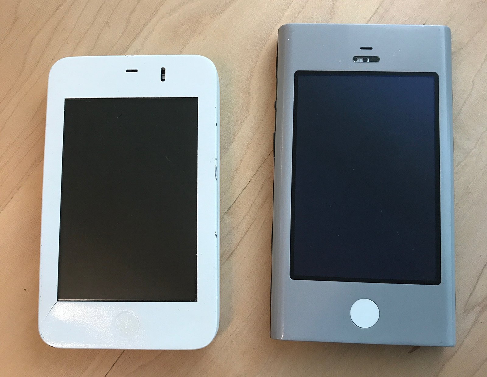
When you look at the Wallabies from Ken’s desk, you can see where the hardware is headed:

iPhone Prototypes from Ken Kocienda's desk.

When you think about what was on those screens, things get more complicated.

This book changed my view of Scott Forstall because it gave context to his work. Ken’s account breaks down the approach and shows how important Scott’s leadership was to Apple’s success.

Having Steve Jobs as a boss for your entire professional career would not be easy, but Scott handled it with great success. Even when that powerful mentor was asking for skeuomorphism.

The hardware would be lesser without Jony, and Ken shows that the software would be lesser without Scott.


If you’re a developer, you’ll find some passages a little slow going. That’s because you know too much :-)

As a great storyteller, Ken endeavors to make the topic as widely understood as possible. To achieve this he turns to analogies in cooking, sports, and the movies while describing the process of creating software.

While we may not need this high-level view, there is an important group that will benefit: our families. If you’re like me, you’ve struggled to explain what you do at that keyboard all day.

We all love our iPads and Kindles for reading, but I’m really glad I have a printed copy of the book to share with the people I love.


I’ve avoided spoilers in this review, but I’ll end with one story that touched me. When asked about the most important thing in development, I always answer with one word: empathy.

Ken links this concept, along with the combination of good taste, the philosophy of Immanuel Kant, and a discussion of atoms by Richard Feynman, all while explaining the choice of a QWERTY keyboard layout.

These complex factors enable a personal connection between people. Imagine being the developer whose choices led to the ability to send a quick message saying “Just landed.” Informing a loved one of your safe arrival transcends the importance of any line of code.

That is work to be proud of and we’re lucky Ken has taken the time to share it with us all.
A Tribute to iBeer

Today’s a big day for app developers.

In the lead-up to today’s event, I spent some time digging through my old purchases. After launching the App Store app, tap on your profile in the upper-right corner, then tap on the Purchased menu of your account page. After spending a few hours scrolling down, you’ll see your first apps!

One of the apps was something called “Carling Tap” – and I had no recollection of anything by that name. A little bit of research helped me remember that the app was formerly named “iBeer”. This hiccup with the name not only paused my scrolling: it also got me thinking about the importance of this early app.

Many of the apps on that first day, including my work with Twitterrific, were adaptations of desktop apps. Things like AIM, NetNewsWire, and Solitaire had many advantages on mobile, but in retrospect, they weren’t a sign of what lay ahead.

Even though it was a gag, iBeer gave us a real glimpse of our future. It was the first app that was spatial. The function of the app was determined by where it was in your world. It could not exist without you.

Since then we’ve seen many other apps take advantage of this unique characteristic of mobile devices. Ocarina made it beautiful. Ride sharing leveraged it for efficiency. Pokémon GO made it fun and communal.

Now we’re heading towards a future where all apps will be spatial. One can only imagine how that will turn out, but it’s likely that the accessories will be fun.

System Fonts in CSS

About three years ago, I wrote a piece on how to get system fonts in CSS. The San Francisco fonts had just been released and getting them onto a web page wasn’t obvious or easy. A recent tweet reminded me that I needed to update this information.

In my original post, I proposed the idea of a generic system font:

The “system” generic family name doesn’t currently exist, but I’d encourage browser manufacturers to adopt this technique.

Apple agreed and made a proposal on the CSS mailing list. Over the next few months that proposal evolved from being called “system” to “system-ui”. (Once upon a time, Windows used a font called “System” that could have caused a conflict.)

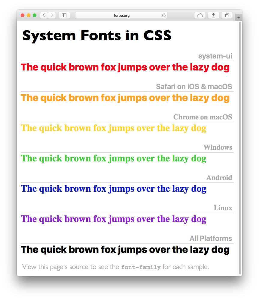
At the end of the day the CSS Font Module was updated and there was an official way to render text just like the operating system.

As every web developer knows, getting a feature into the spec is one thing and getting it into the browser is quite another. Luckily the adoption of system-ui has been quick. Both Chrome and Safari support it fully on a wide variety of platforms. Only Mozilla and Windows are lagging behind.

In many cases, you’ll also have to take backward compatibility into account — not every visitor has the latest & greatest browser. This CSS should cover all the bases:

font-family: system-ui, -apple-system, BlinkMacSystemFont, "Segoe UI",
    "Roboto", "Oxygen", "Ubuntu", "Cantarell", "Fira Sans",
    "Droid Sans", "Helvetica Neue", sans-serif;

(For more information on what those font names mean, see Marcin Wichary’s article in Smashing Magazine.)

If you’d like to see how this new generic font-family works, here’s a simple page that can be used to test any platform.

This whole process has been fascinating for me to watch. What started as a simple idea ended up being discussed and implemented by dozens of talented engineers. The result is a web that’s better and easier for a lot of folks.

Updated June 30th, 2020: Apple has added additional CSS classes for different types of user interfaces (starts at 14:25). The new font families, ui-sans-serif, ui-serif, ui-monospace, and ui-rounded allow you to get a specific faces of the system fonts (both in San Francisco and New York). These new families were introduced in Safari 13.1. For more information, check out the details of UI typography at WWDC.

Benchmarking in your pants – 10th Anniversary Edition™

One of my favorite posts is one that’s over ten years old: Benchmarking in your pants.

In that essay, I compared the original iPhone to my iMac, both with native and web apps. One of the reviewers of my treatise on the iPhone SDK thought it would be fun to see how those numbers stack up to an iPhone X.

The code still runs, so why not?

Test Original iPhone iPhone X Faster by
100,000 iterations 0.015 secs. 0.000408 secs. 36x
10,000 divisions 0.004 0.000043 93x
10,000 sin(x) calls 0.105 0.000107 981x
10,000 string allocations 0.085 0.000367 230x
10,000 function calls 0.004 0.000040 100x

These numbers should be considered very approximate. I only used three digits of precision in the original measurements, this time over 5 were needed. Also, there was no attempt to use more than one core.

Still, it’s easy to see why today’s apps are much more sophisticated. They run code hundreds of times faster.

They also have screens that are a bit larger than 320 × 480 :-)

How Not to Do Accessibility

I’m 57 years old and my eyesight is getting worse every year. As a result, I have a newfound appreciation for the accessibility features that Apple builds into its products: they’re a lifeline for people who have problems worse than mine.

With such a unique and concerted effort towards accessibility, it’s surprising to see Apple ship a major OS release with a glaring usability issue. Yet that’s what we have in watchOS 4 when Bold Text is enabled.

I originally started using Bold Text at the suggestion of a friend and purely for aesthetic reasons. But as I used this feature, I found it also helped me read the information on my watch. It became an essential part of my user experience.

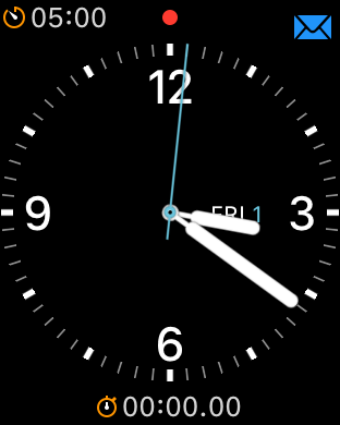
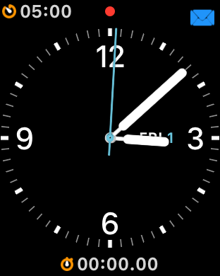
If you’re one of the lucky people who’s not using Bold Text on watchOS 4, you’re used to seeing clear and crisp icons for complications:

On the other hand, if you’re using Bold Text to help with legibility, you’ll find that the complication icons are fuzzy and sometimes impossible to distinguish:

What’s particularly concerning about this issue is the imprecise rendering has been around since I first reported it in watchOS 2.2 over two years ago!

(The gray part of the image above is a template for what should be rendered, the blue part is the what’s drawn on screen.)

It’s annoying when your assets aren’t displayed correctly, but the fringing artifacts in Clicker don’t affect its accessibility.

But now this problem has worked its way onto the most important part of my Apple Watch and makes it hard for me to tell what’s on its face. It’s time to either fix this damn bug or rename the setting Bold Text and Complications That Look Like Ass.