Yeah, I see a lot of icons in my business. I often get asked what makes for a successful desktop icon. And I’ve answered many times—but never in public. This essay also gives me a chance to write about something other than the iPhone :-)
Let me begin with this disclaimer: this discussion is directed at independent software (”indie”) developers. Our corporate clients, like Adobe, Apple and Microsoft, have very different needs and objectives when dealing with iconography for software suites. Please also remember that I’m a software developer by trade, not a designer (although, I’m not completely clueless when it comes to the arts.) This discussion will cover a lot of things designers already know—and things that developers need to know.
Before I talk about the specifics of icon design, it’s important to realize what your application icon represents. It’s your brand: it shows up in the Dock, on your download page, and in product reviews. People may remember your app icon more than they remember your product name. A strong icon design results in an equally strong brand.
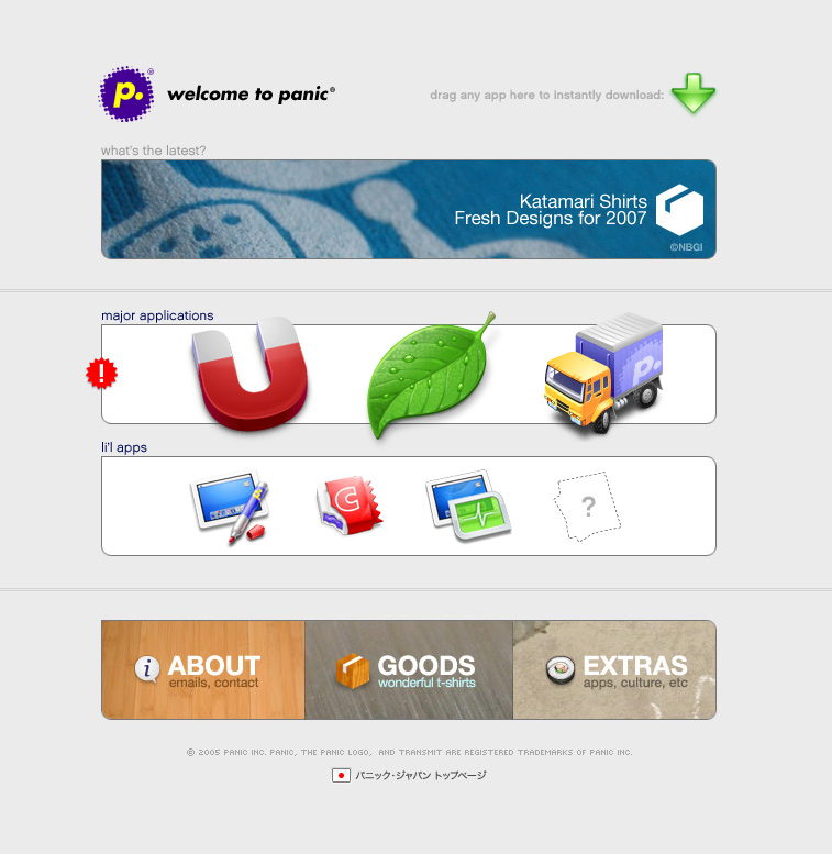
What do you think of when I describe an icon that’s a truck sporting a yellow cab with a purple cargo?
That’s Transmit’s brand. It’s so good, other people want to use it.
Would you believe that people actually thank us for making that little truck icon? It’s true—an icon can have a huge impact on people’s perception of your product. If your app is a joy to look at in the Dock, people will be in the right frame of mind when launching the application.
This effect of good design is contagious, too. The Twitterrific icon is an example; the strength of the icon has carried over into other applications either directly or indirectly. People associate a blue bird with Twitter now—at the time we created the application, Twitter’s only brand was the word mark.
It’s also important for your design to be unique. The world doesn’t need another globe icon for a network application. Be careful about using the “document and tool on the desktop” metaphor; it may be recommended by the HIG, but it also means you’re playing on a field crowded with other similar designs.
Of course there is still room for creativity when working with familiar metaphors. If you look at Bryan Bell’s icon for NetNewsWire or Jon Hicks’ work for Firefox, you’ll see that the globe is a secondary element in the design. The complementary colors of the satellite and the fox are what draw your eye and make the image memorable.
One of the most unique icons to come around in a long time it the Coda icon. (I feel fine making that claim because I had no substantive involvement in its design—I’m just happy to have it in my Dock.)
There’s a interesting story that went along with this icon’s creation. This story illustrates how much thinking and rethinking goes into a successful design. It also shows that you shouldn’t work in a vacuum when dealing with something as important as defining your brand.
The early concepts for Coda’s app icon was a forklift; a natural extension to the Panic truck. But the release of a similar application that used this metaphor forced us to consider a new direction. In retrospect, that was one of the best things that happened in the project.
So without a forklift to work with, some more brainstorming ensued. Gedeon Maheux came up with the idea of using a leaf or seedling to represent the continual care and growth that a web application typically receives. Dave Brasgalla started developing this concept with a series of hand drawn sketches and simple vector artwork.
 Original concept sketch for Coda
Cabel Sasser, who did the UI design for Coda, liked the concept sketch, but was hesitant about its use in their product. Ged convinced him it was a good idea because of its uniqueness.
Once we got the go ahead from Cabel, David Lanham started developing the icon. As with any design job, there were multiple revisions before everyone was happy. I first saw the icon toward its final revision (before the addition of trichomes and the rearrangement of water droplets.) Like Cabel, I had doubts about the icon’s simplicity.
 Coda icon before its final release
The deciding factor was that it stood out on product website and in a list of other icons. Its simplicity and uniqueness was its greatest strength.
 Composition showing how Coda icon would show up on Panic website
And the punchline for this story: a conversation with Cabel at this year’s WWDC revealed that he and Steven Frank originally had the idea of doing a leaf to represent their web studio application. But they discounted it and never mentioned it anyone. I guess that means that great minds really do think alike :-)
Note: There’s more that I’d like to show about this project, but I don’t want to steal any thunder from Cabel and his presentation at C4. Hopefully this post will whet your appetite as much as a link to Gina’s. It would also be safe to assume that this post will be updated sometime after our little get together in Chicago :-)
So what should you look for when developing your own application icon? It’s really pretty simple when you get down to it—the key elements are:
When dealing with these elements, strive for simplicity and clarity. How the icon looks at 16×16 pixels is just as important as its representation at 512×512. Complexity in the larger sizes will not work well at the smaller sizes. A vibrant color that looks great at 16×16 might be overpowering at 512×512.
To get an idea of how these two elements are important, let’s do a little experiment. (Regular readers will find that I love doing “real world” tests to back up my statements.)
Open your Applications folder and set the list view to the smallest size (16×16.) Now scroll down through the list and pick out which icons jump out at you. Now ask yourself why—the answer is color and/or shape.
Here are the applications that caught my interest, their strongest design element, and some thoughts I have about each one:
Adium (color & shape)
A green duck makes a strong statement, although I think making the color a preference is taking customization a bit too far.
Firefox (color)
Circular icons tend to be overused, but the fox’s “C” shape overcomes this.
GarageBand (shape)
A unique shape that draws the attention of people who like music (like me.)
NetNewsWire (color)
The complementary colors in this icon are particularly strong and make for a very dynamic icon.
PhotoBooth (color)
Unique in that it successfully uses a gradient—ranges of color typically get lost in smaller sizes.
Skype (color & shape)
One of the few icons that incorporates the word mark clearly and successfully.
Parallels (color & shape)
I have no idea what the shape represents, but it’s unique and clearly represents the brand. Without the gold coloring, the shape would be reminiscent of the brand used by DC Shoes.
QuickTime (shape & color)
A clever icon that uses the letter “Q” to represent the brand. It’s been around a long time and still looks good—you can’t say that about most applications that were released in the early 1990’s.
Hopefully this essay has given you some basic insights on how to approach the design (or redesign) of your application’s icon. There’s no way that a fantastic icon can overcome crappy code, but something nice to look at will definitely affect people’s perception of your hard work. And be sure to give brand development as much care and thought as the lines of source code in your project: it’s not something that you just slap on your application before you ship.

 Original concept sketch for Coda