AMBER Alert Usability

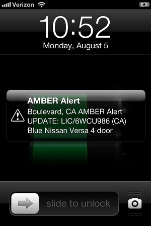
If you live in the State of California, you got an AMBER Alert last night just before 11 PM. If you have an iOS device, you saw something like this on your lock screen:
Or like this in Notification Center:
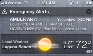
And if you’re like most people, you had no idea what it meant. Considering it’s a broadcast to locate missing children, that’s a bad thing. Let’s examine the usability of this alert and think about how this system can be improved.

Updated August 6th, 2013: Lex Friedman has written a great summary of AMBER Alerts at Macworld. Among the revelations: the text of the messages are limited to just 90 characters!

First Impressions

In our household, there are many iOS devices. At the time of the alert, we were in the living room with two iPads and an iPhone. The alert’s sound is designed to get your attention, and that it did!

Both my wife and I gave each other that “what the hell is wrong” look as I grabbed my iPhone from my pocket. Turns out we weren’t the only ones who were frightened by the sound:

My wife’s first question as I looked at my phone was “Are we having a tsunami?” (we’ve had these kind of emergency broadcasts before.) I replied with, “No, It’s an AMBER Alert”. To which she replied, “What’s that?”

And therein lies the first problem: I had no idea.

Unlike all other notifications on my iPhone, I couldn’t interact with the alert. There was no way to slide the icon for more information or tap on it in the Notification Center to get additional information. Through a combination of Google and my Twitter timeline, I eventually figured it out:

But I was also seeing a lot of people on Twitter whose response to the confusion was to ask how to turn the damn thing off. And since AMBER Alerts aren’t affected by the “Do Not Disturb” settings, a lot of people went to Settings > Notification Center so they wouldn’t get woken again in the future.

That’s exactly what you don’t want to happen when a child is abducted.

Alert Text

In looking at the message itself, it’s hard to tell what it’s about. Starting an alert with an acronym may make sense to the government, but there’s wording that could resonate much effectively with normal folks:

It’s also hard to tell if this is a problem with “Boulevard, CA” or a “Nissan Versa”. And where is Boulevard? And what does a Nissan Versa look like? Who do I call if I see license 6WCU986? In summary, this notification provides more questions than answers.

This one image has answers to all of these questions and more. Why can’t I see that image after tapping on the notification?

The Alert Sound

As I mentioned above, the sound definitely let us know that something was wrong. But we were sitting comfortably in our living room. A friend of mine was driving at the time and probably listening to music from their iPhone on a car stereo. Being startled at high speed is dangerous:

Unlike the devices that existed when the AMBER Alert system was first introduced in 1996, our iPhones and iPads do a lot more than calls and texts. Music and video are immersive activities and hearing a loud horn can be a cure that’s worse than the disease.

Also, we’re all conditioned to immediately look at our phone when the normal alert sounds are used: a simple ding would have gotten just as much attention.

Do Not Disturb

And what the heck is up with this crazy sound happening if Do Not Disturb is turned on? Dammit, it’s my phone and I get to tell it what to do. Stupid Apple!

Well, take a look at your government first:

And if you want the details, it’s only going to cost you $205 to download:

Bottom line: these bugs aren’t going to be easy fixes.

(And if you think getting woken up because of an AMBER Alert is such a terrible thing, why don’t you explain your pitiful situation to this boy’s parents.)

File A Radar

Even though these bugs probably aren’t Apple’s direct problem, I’m still going to file a bug report. If you have a developer account, please feel free to duplicate that Radar.

Apple is in a very unique position to address these issues:

  • It has direct access to millions of customers and their mobile devices.
  • It employs many people with a deep understanding of how mobile devices are affecting our lives.

This is clearly a problem where cooperation between Apple, the Department of Justice, and the public can improve a system where everyone benefits. Better usability with AMBER Alerts is case where “think of the children” isn’t a trite platitude.
App Updates for iOS 7

Like many of my fellow developers, I am in the middle of an update of an app for iOS 7. As you’d expect, it’s a lot more work than previous versions of iOS. But results are stunning: both David Lanham and I have commented that our shipping version was “feeling old and clunky.”

While cranking along on the update, a couple of thoughts occurred to me: how many other developers were doing the same thing and were they going to commit fully to iOS 7? The depth and breadth of the changes in iOS 7 makes it difficult to support older versions of the OS.

So I just asked. I also included a simple question that any developer who was actively working on an update would be able to answer as a sort of CAPTCHA.

After a little over 24 hours, I had my answers:

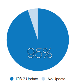
An overwhelming number of developers are updating apps for iOS 7. Of 575 valid responses, 545 developers indicated that they were working on an update for iOS 7. That’s an adoption rate of 95%!

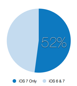
Of those developers who were working on an update, I then calculated how many were going to require iOS 7 (and drop support for iOS 6):

Just over half of developers (284 of 545) were leaving the past behind. Initially I was surprised that this number was so high, but then I remembered how much time and effort I was putting into my own work :-)

If you’re a consumer of apps, this is great news: it’s likely that your favorite apps will be ready for action come this fall. If you’re someone who has a device that’s a couple of years old, now’s the time to start thinking about upgrading. Many apps will require a device capable of running iOS 7.

After I posted the survey, I heard from several game developers who complained that they didn’t know the answer to the trick question: UIView -tintColor is only used in traditional interfaces. Most of the difficulty in adapting apps is changing navigational and content elements to match the new style. Games don’t have this problem: they’re basically all content. Considering these facts, my guess is that games will have much broader support for older versions of iOS.

If you’d like the raw data and my analysis using Numbers, here you go: iOS_7_Updates.numbers

The Origin of Tweet

Last week, one of my colleagues informed me that the word “tweet” was now included in the Oxford English Dictionary (see “Quiet announcement” at the end of the page.)

The noun and verb tweet (in the social-networking sense) has just been added to the OED. This breaks at least one OED rule, namely that a new word needs to be current for ten years before consideration for inclusion. But it seems to be catching on.

John Simpson
Chief Editor, Oxford English Dictionary

It’s not everyday that a word you helped create gets added to this prestigious publication, so I thought I’d share a bit of the early history of the word “tweet.”

In the early days of Twitter, the service used “twittering” as a verb and “twitter-ers” as a noun. The December 2006 newsletter is a great example of the lingo that was in use back then:

From: "Biz Stone"  
Date: Wed, 06 Dec 2006 07:51:31 +1100
Subject: Twitter Now Supports AIM and More

Hello Twitter-ers!

Things are really heating up at Twitter headquarters these days.  Last month, the number of Twitter users doubled and it looks like it's going to double again before we run out of December. We  thought the best way to react to all this positive activity would be to keep on making improvements. So come on by and check out  http://twitter.com!

…

That's it for now, Happy Twittering!
Biz Stone and The Twitter Team
http://twitter.com/biz

I started started using Twitter at the beginning of December. Like John Gruber and my colleagues at the Iconfactory, I loved our new “water cooler for the Internet.” I was, however, unhappy with using Twitter via the website or Dashboard widgets.

While taking a shower in the middle of December, an idea struck me: it wouldn’t be hard to hook up Twitter’s new API to the Cocoa networking classes and display a table with tweets. So I dried off and started prototyping: the next day I had the world’s first Twitter client running on my Mac.

A few days later, I checked all my code into our repository and Twitterrific was born:

r174 | craig | 2006-12-20 17:54:11 -0800 (Wed, 20 Dec 2006) | 1 line

Initial import

There was a problem, however.

As I started to implement the user interface, it was clear that nouns and verbs were needed. Menu items with labels like “Post a Twitter Update” were both wordy and boring. And as someone who loves language, using a phrase like “Refresh Twitterings” made the hairs on the back of my neck stand up.

So we started calling them “twits”; more as a placeholder than anything. Using the term in January 2007 felt just as awkward as it does today:

@Dan: my wife was using the Mac when your twit popped up, followed by “there’s a guy named Dan who’s looking for love”. Classic.

(Thanks to Jordan Kay at Twitter for digging that tweet up. Also, the “Dan” is Dan Benjamin—in those early days we hadn’t figured out screen names, and as far as I knew, there was only one Dan on Twitter!)

Luckily, things were about to change. On the 3rd of January, I checked in a temporary application icon. I always check in something crappy as an inspiration for the talented folks I work with:

r215 | craig | 2007-01-03 13:46:11 -0800 (Wed, 03 Jan 2007) | 1 line

Added a temporary application icon. Updated preferences panel (with quit and about info.) Tweaked on window size. Added expanded size to preferences. 

Less than 24 hours later, David Lanham sent me something much better.

I couldn’t check it in quickly enough:

r225 | craig | 2007-01-04 13:21:01 -0800 (Thu, 04 Jan 2007) | 2 lines

Added new app icon

We didn’t know it at the time, but this is also the moment when a bird became synonymous with Twitter. Prior to that point in time, Twitter’s only identity was a logotype.

Work was proceeding at a very fast pace during the first week of January 2007. Beta releases were frequent and widely distributed. Fortunately, the folks at Twitter were using our app with its snazzy new bird icon. One of our beta testers was an API engineer named Blaine Cook who sent me the following email:

From: "Blaine Cook" <[REDACTED]>
To: "Craig Hockenberry" <[REDACTED]>
Date: Thu, 11 Jan 2007 18:29:01 -0800
Subject: Twitterific

Hey Craig,

I work on Twitter with Jack, and just wanted to ping you re: Twitterific. First off, great work - I love it, and I think so does everyone else in the office! :-)

Two thoughts; first, how about changing "twit" to "tweet" - the "official noun" is "Twitter Update", but that's boring...? 

Second, I'm in the process of building a real (re: flickr-style) authentication API, so that you'll be able to obtain tokens for users without having to store their usernames and passwords. I don't want its pending release to stall your development or release date, since we will continue to support basic auth for existing clients, but would you be interested in beta-testing the api machinations? 

Thanks again for Twitterific!

blaine.

(In retrospect, this email is also the first hint that we spelled the app’s name wrong!)

It’s rare to have unanimous agreement when naming things in software, but in this case everyone loved the word “tweet”. I quickly updated both the app and the website:

r263 | craig | 2007-01-12 11:46:22 -0800 (Fri, 12 Jan 2007) | 1 line

Changed "twits" to "tweets". Removed auto launch of Twitterrific web page. Added link to Twitterrific web page in config window.
r2183 | craig | 2007-01-12 11:44:07 -0800 (Fri, 12 Jan 2007) | 1 line

Changed "twits" to "tweets"

And not a moment too soon! We released the first version of Twitterrific just three days later with the following copy on the product website:

About Twitterrific

Twitterrific is a fun little application that lets you both read and publish posts or “tweets” to the Twitter community website. The application’s user interface is clean, concise and designed to take up a minimum of real estate on your Mac’s desktop.

This is the first time “tweet” appeared on the Internet in reference to something you do on Twitter.

Our new app was a hit with users everywhere. We even got a mention in Twitter’s next newsletter:

From: "Biz Stone"  
Date: Wed, 17 Jan 2007 07:37:07 +1100
Subject: =Things Are Heating Up At Twitter

Hello Twitter-ers!

…

Continued Hotness: Twitterrific

The folks over at The Icon Factory have created a brilliant little application that lets you both read and post updates to Twitter. The application's user interface is clean, concise and designed to take up a minimum of real estate on your Mac's desktop. Twitter headquarters is sporting this little jobbie on every monitor in the house! Download it for free from The Icon Factory web site.

Twitterrific: http://iconfactory.com/software/twitterrific

…

Things are heating up!
-Biz Stone and The Twitter Team
http://twitter.com/biz

Unfortunately, the work I had done to expunge “twit” from our app was not complete: I had forgotten to remove it from some button tooltips. After the release of version 1.1 on January 25th, “twit” was gone for good.

Even though the use of the word “tweet” spread quickly, Twitter took awhile to embrace the new terminology. Even after several months, “twitter-ers” were still “twittering”.

As far as I know, the first time “tweet” appeared on Twitter’s site was when they referred to our product. (And yes, there was a point in time when the founder of Twitter would send us feature suggestions!)

Almost a year later, “tweet” was used on the company blog (but again, in a quote by a third party).

The word “tweet” didn’t appear unquoted on Twitter’s blog until June of 2008. Coincidentally, it was in reference to the WWDC where we won an Apple Design Award for Twitterrific!

It still feels strange to hear a word I helped create be mentioned over and over again in the media. It’s a great word to go along with a great service, and in the end, I’m just happy we’re not calling each other twits!

Addendum – July 13th, 2013

I dug around through my Twitter archive and came up with some interesting tweets that show how and when the first Twitter client came to be.

The first notion that Twitter didn’t belong solely on the web happened on December 5th, 2006 (a couple of weeks before the first check-in in the Twitterrific repository.) This line of thinking was inspired by a tweet John Gruber had posted about the Dashboard widget he was using:

Less than an hour later, I posted this:

A couple of days later, I started poking around with the new Twitter API:

(Note that in the early days of Twitter, the website was designed around @jack’s original idea of posting status messages. The user name was implied in the post, hence “Craig Hockenberry” “is experimenting”.)

By the 20th of December, I felt confident enough in the state of the project to go public (that’s also the day that the prototype code got checked into the repository):

At the Iconfactory, everyone gets a two week Christmas break. I’d rather code than shop :-)

Unlike many products, we knew the name of what we were building very early on:

And from this point on, I never posted from the website again:

Here’s the first tweet with a source parameter (that tells Twitter which client posted the tweet.) We worked with Twitter engineering to implement this, and for a long time Twitterrific was the only source besides “web”. Note that this happened just two days before the release!

Of course on January 14th, 2007, the release was announced on Twitter:

Been There, Done That

We’re all thinking a lot different today.

Designers and developers alike are coming to terms with Apple’s latest iteration of iOS. As I tweeted just before the announcement, there is only one way to describe it:

shock |SHäk| noun
• a sudden upsetting or surprising event or experience.

Those of us who’ve been around awhile had a similar experience 13 years ago. Apple switched from the Classic interface in Mac OS to a new Aqua interface. As fate would have it, I was in the room with some of my colleagues when Steve Jobs introduced a UI “that you wanted to lick.” We all left that keynote in the same state of shock as we experienced yesterday.

I think it’s useful to look at the history of Aqua while thinking about the future of iOS 7.

Some designers are saying that the new look is “over the top.” The same thing was said about Aqua over a decade ago. And in succeeding years, that original UI has continuously been refined to what we see today.

We’ve become accustomed to Apple’s incremental approach which continuously refines their products. This is typically an additive process where new features are included or existing ones are improved.

But with major user interface changes such as Aqua or iOS 7, Apple has another tendency: they overshoot the mark. Their incremental approach then becomes one where unnecessary items are removed (such as Aqua’s stripes) or improved (excessive shadows and transparency are toned down.)

There’s a good reason for this: it’s much easier to take away elements from a design than it is to add them. Simplicity is achieved by removing that which is not really needed.

One parallel with iOS 7 and Aqua that I don’t expect to see: an evolution that takes over a decade. There are a couple of reasons for this.

The first is that the pace of development for iOS is much faster than we’ve ever seen for OS X. Ask any developer and you’ll hear the same thing: it’s a constant struggle to keep up with Apple’s improvements on iOS. Shit happens, and it happens quickly.

Another is the amount of time Apple’s designers have had to work on this project. The decision to put Jony Ive in charge of the interface design happened in October: a mere eight months ago. A major overhaul of a system-wide interface takes much longer than that.

It would not surprise me to learn that the developers had a very short time with the graphical assets we saw yesterday (think in terms of weeks.) This would also explain why the first beta is only available for smaller screens. The development work to support larger screens is relatively easy, but specifying the layouts and generating the assets is much harder.

Another important aspect to consider is the conditions where this new user interface was being evaluated. Every iOS developer who was using iOS 7 prior to yesterday’s announcement was using a security screen. These screens distort the colors and other elements on screen. Try looking at your laptop screen with polarized sunglasses and you’ll see what I mean.

Apple’s “doubling down on secrecy” also played a part. No friends or family were able to see an engineer’s work-in-progress. It’s likely that no one outside the engineering organization was able to give feedback on what they saw. I can think of a few types of users where this kind of criticism is essential: kids that can’t read, friends with vision impairment and parents with failing eyesight.

The good news, and reason I think that we’ll see many improvements before the fall, is because these kinds of surface changes are relatively easy to implement.

Which leads me to my final points: what are the most exciting parts about what happened yesterday?

It’s hard to tell from the keynote, but all of the interactions that surround the app you’re using are vastly superior. Unlike the visual redesign, the work on Springboard feels more mature. It’s likely that work has been underway for a much longer period of time (probably before last year’s WWDC.) Moving around in iOS is so much more fluid and natural.

Like with Aqua, these fundamental changes in how things work will stick around for a long time. We may complain about how things look in the short term, but improvements in usability will be something that we value much more in the long term.

But more importantly, and more subtly, is the change of focus within the apps themselves. In the design of Twitterrific 5, we went through the process of figuring out what content was most important and then designing controls around that information. Previous designs focused on the control structure first and then filled it with content.

(It’s also interesting to note that apps like Twitterrific and Vesper, which take this content-centric approach, also immediately feel at home on iOS 7.)

It’s clear that Apple’s designers have done the same thing: their focus has shifted towards content. I can’t wait to see what happens to the iOS ecosystem when other designers and developers follow their lead. That path forward won’t be easy, but it will take the platform to a whole new level. Yet another example of “can’t innovate any more, my ass”.

Launch Services Woes

For the past week or so, I’ve been suffering from slowness in the Finder, corrupted icons and terrible performance in our version control client (Versions).

Today, I decided to do something about it. The first step was to sample Versions while it was beachballing. The app was spending most of its time in [NSWorkspace iconForFile:]. That, along with the corrupted icons I was seeing in various apps made me suspect that there was a corrupted database somewhere. But where?

After a lot of Googling, I finally found this link. The path to lsregister has changed a bit in Mountain Lion, so this is the command I ended up using:

/System/Library/Frameworks/CoreServices.framework/Versions/A/Frameworks/LaunchServices.framework/Versions/A/Support/lsregister -kill -seed -r

My development machine immediately felt like it was running at normal speed (I refuse to say snappy until they update the Mac Pros.) And, of course, as soon as I figured that out, I found that someone smarter had beaten me to it.

So how did this happen? In looking at the documentation for the Launch Services database, there is a lot of information that’s collected when applications are first launched. As developers, we launch applications all fricken’ day. And we also know that pounding on a database is the best way to break it.

So, the next time you’re seeing general slowness on your Mac, don’t forget to give Launch Services a kick in the pants. Guaranteed to be more effective than zapping your PRAM.